5
More Annotations


1

2
Favourite Annotations


2


2
Text
ABOUT – USER FRIENDLY Since this blog has been many years in the making, I have lost count of the people I need to thank. That been said, my thanks are nonetheless sincere. None of this would have happened without every single one of you, so I thank you all from the bottom of my heart. To
the family
VISUAL CHARTS
Posts about Visual charts written by Alesandra Blakeston. User Friendly Leadership pointers, innovation, creativity, design tips and templates, effective communication and how to guides by AlesandraBlakeston
BCG MATRIX CHART
Having used this type of chart a lot recently, I thought it was time I had a decent version in Excel. In case you are not aware a BCG matrix, also known as a growth-share matrix is a management planning tool. It is used to portray a company's / SBU's product portfolio on a quadrant showing relative market share BROKEN COLUMN AND BAR CHARTS DOUBLE LOLLIPOP CHART Visually great charts are always welcome in my inbox, so when a friend forwarded a link to me showing a tutorial on how to create a double lollipop chart, I was intrigued. A double lollipop chart (not to confused with a cherry chart - although it looks very similar) is used to compare target vs HOW TO CREATE UNIQUE SQUARE PIE CHARTS BROKEN COLUMN WITH A STACKED BAR CHART The original post creates a broken column chart using a standard stacked column chart to create the before, break and after series combined with an XY scatter chart to create the custom axis as shown in the picture below. However, if you want to have multiple data sets and already have a stacked column, it can make altering the templatefile I
BOXED TEMPLATE
Another week, another template One of my previous templates, Metro UI Style template was such a big hit, I was asked to create another in a similar flat style. This time I was asked for something bright and bold. When I asked for two words to describe the template, I was given bubblegum and dark. SoTRAFFIC LIGHT CHART
WHEEL OF DISCOVERY TEMPLATE Wheel of Discovery Template. It’s time for another Friday Freebie!!! This one is a quiz show template which you can use to ask questions in a fun interactive way during a presentation, or use it for eLearning purposes to let the learner dictate which questions they respond to. Based on the TV show wheel of fortune – which is hopefully ABOUT – USER FRIENDLY Since this blog has been many years in the making, I have lost count of the people I need to thank. That been said, my thanks are nonetheless sincere. None of this would have happened without every single one of you, so I thank you all from the bottom of my heart. Tothe family
VISUAL CHARTS
Posts about Visual charts written by Alesandra Blakeston. User Friendly Leadership pointers, innovation, creativity, design tips and templates, effective communication and how to guides by AlesandraBlakeston
BCG MATRIX CHART
Having used this type of chart a lot recently, I thought it was time I had a decent version in Excel. In case you are not aware a BCG matrix, also known as a growth-share matrix is a management planning tool. It is used to portray a company's / SBU's product portfolio on a quadrant showing relative market share BROKEN COLUMN AND BAR CHARTS DOUBLE LOLLIPOP CHART Visually great charts are always welcome in my inbox, so when a friend forwarded a link to me showing a tutorial on how to create a double lollipop chart, I was intrigued. A double lollipop chart (not to confused with a cherry chart - although it looks very similar) is used to compare target vs HOW TO CREATE UNIQUE SQUARE PIE CHARTS BROKEN COLUMN WITH A STACKED BAR CHART The original post creates a broken column chart using a standard stacked column chart to create the before, break and after series combined with an XY scatter chart to create the custom axis as shown in the picture below. However, if you want to have multiple data sets and already have a stacked column, it can make altering the templatefile I
BOXED TEMPLATE
Another week, another template One of my previous templates, Metro UI Style template was such a big hit, I was asked to create another in a similar flat style. This time I was asked for something bright and bold. When I asked for two words to describe the template, I was given bubblegum and dark. SoTRAFFIC LIGHT CHART
WHEEL OF DISCOVERY TEMPLATE Wheel of Discovery Template. It’s time for another Friday Freebie!!! This one is a quiz show template which you can use to ask questions in a fun interactive way during a presentation, or use it for eLearning purposes to let the learner dictate which questions they respond to. Based on the TV show wheel of fortune – which is hopefullyUSER FRIENDLY
Leadership pointers, innovation, creativity, design tips and templates, effective communication and how to guides by AlesandraBlakeston
BROKEN COLUMN AND BAR CHARTS First, highlight columns C, D and E and then click on the Insert tab > Column > 2D stacked column. Excel will create a chart as shown below: Right click on the chart and then click on “Select Data” and click on the “Edit” button to adjust the Horizontal (Category) Axis labels. Use column A as the range. HOW TO CREATE UNIQUE SQUARE PIE CHARTS Pie charts are notoriously difficult to read. That being said, I still see plenty out there. Since I'm not a fan, I tend to replace them with bullet charts, thermometers etc. Another way to replace them is with a "Square" pie chart: These 2 charts only show one data point, but you can show multiple data HOW TO CREATE A BCG MATRIX IN EXCEL Having used this type of chart a lot recently, I thought it was time I had a decent version in Excel. In case you are not aware a BCG matrix, also known as a growth-share matrix is a management planning tool. It is used to portray a company's / SBU's productVISUAL CHARTS
Posts about Visual charts written by Alesandra Blakeston. User Friendly Leadership pointers, innovation, creativity, design tips and templates, effective communication and how to guides by AlesandraBlakeston
HIGHLIGHTING THE DIFFERENCE BETWEEN ACTUAL AND TARGET Step 1: Set up your data table. Your original data table with the actual and target columns will probably look something similar to the one below: Add three extra columns in between your actual and target columns and label them “Copy”, “Diff mid” and “Difference”: In the “Copy” column simply copy the data fromthe actual column.
TRAINING TOOL: BINGO QUIZ At a recent "Train the trainers" training session, I was asked to propose and then facilitate a warm up game. Since the conference was for would be trainers, it seemed appropriate to have a game that revolved around training. Unfortunately, I only had 10 minutes. Not a huge amount of time to do anything substantial CHANGE & INNOVATION QUOTES I’ve been spending a lot of my time recently reading up about innovation and change. So, I thought I would put together a presentation showing some of my favourite quotes on EXCEL 2010 GROWTH SHARE MATRIX Posts about excel 2010 growth share matrix written by AlesandraBlakeston
USER FRIENDLY
It seems very obvious now, that by asking yourself and others to think about who they could be next keeps us from falling into the trap of believing we have arrived, and that keeps us living in a world of possibilities instead of protecting and defending the current reality. ABOUT – USER FRIENDLY Since this blog has been many years in the making, I have lost count of the people I need to thank. That been said, my thanks are nonetheless sincere. None of this would have happened without every single one of you, so I thank you all from the bottom of my heart. Tothe family
BCG MATRIX CHART
Having used this type of chart a lot recently, I thought it was time I had a decent version in Excel. In case you are not aware a BCG matrix, also known as a growth-share matrix is a management planning tool. It is used to portray a company's / SBU's product portfolio on a quadrant showing relative market shareVISUAL CHARTS
Posts about Visual charts written by Alesandra Blakeston. User Friendly Leadership pointers, innovation, creativity, design tips and templates, effective communication and how to guides by AlesandraBlakeston
DOUBLE LOLLIPOP CHART Visually great charts are always welcome in my inbox, so when a friend forwarded a link to me showing a tutorial on how to create a double lollipop chart, I was intrigued. A double lollipop chart (not to confused with a cherry chart - although it looks very similar) is used to compare target vsSTUNNING POWERPOINT
Posts about Stunning PowerPoint written by Alesandra Blakeston. User Friendly Leadership pointers, innovation, creativity, design tips and templates, effective communication and how to guides by AlesandraBlakeston
TRAFFIC LIGHT CHART
ABOUT – USER FRIENDLY Since this blog has been many years in the making, I have lost count of the people I need to thank. That been said, my thanks are nonetheless sincere. None of this would have happened without every single one of you, so I thank you all from the bottom of my heart. Tothe family
BCG MATRIX CHART
Having used this type of chart a lot recently, I thought it was time I had a decent version in Excel. In case you are not aware a BCG matrix, also known as a growth-share matrix is a management planning tool. It is used to portray a company's / SBU's product portfolio on a quadrant showing relative market shareVISUAL CHARTS
Posts about Visual charts written by Alesandra Blakeston. User Friendly Leadership pointers, innovation, creativity, design tips and templates, effective communication and how to guides by AlesandraBlakeston
DOUBLE LOLLIPOP CHART Visually great charts are always welcome in my inbox, so when a friend forwarded a link to me showing a tutorial on how to create a double lollipop chart, I was intrigued. A double lollipop chart (not to confused with a cherry chart - although it looks very similar) is used to compare target vsSTUNNING POWERPOINT
Posts about Stunning PowerPoint written by Alesandra Blakeston. User Friendly Leadership pointers, innovation, creativity, design tips and templates, effective communication and how to guides by AlesandraBlakeston
TRAFFIC LIGHT CHART
HIGHLIGHT A TIME PERIOD ON A LINE CHART So today I thought I would post the "how to" for the third in the series of line charts I posted a while back. Let's imagine that you want to highlight a poor period during your year. This chart is ideal for that purpose, using a combination line / area chart with droplines. You can
CREATE LINE CHARTS WITH CONFIDENCE BANDS User Friendly Leadership pointers, innovation, creativity, design tips and templates, effective communication and how to guides by AlesandraBlakeston
HOW TO CREATE DEMOGRAPHIC CHARTS FOR INFOGRAPHICS Creating charts for infographics is not easy. You need a chart that is simple and easy to read and one that doesn't need a lot of text or explanation. To that end I wondered if I could create this kind of chart using Excel It's actually relatively easy. Let's imagine that you want to create an HIGHLIGHTING THE DIFFERENCE BETWEEN ACTUAL AND TARGET Sometimes it is important to know the performance against a target. There are of course lots of ways of doing this, my favourite being bullet charts. That being said, you can also show this with line charts if you have a lot of data points over time for example. If youare a regular
YAMAZUMI CHARTS
The Yamazumi chart – also known as the operator line balance chart – is a load chart that breaks down the individual work tasks in a process, detailing the time they take. Obviously, itVISUAL CHARTS
Posts about Visual charts written by Alesandra Blakeston. User Friendly Leadership pointers, innovation, creativity, design tips and templates, effective communication and how to guides by AlesandraBlakeston
TRAINING TOOL: BINGO QUIZ At a recent "Train the trainers" training session, I was asked to propose and then facilitate a warm up game. Since the conference was for would be trainers, it seemed appropriate to have a game that revolved around training. Unfortunately, I only had 10 minutes. Not a huge amount of time to do anything substantialBOXED TEMPLATE
Another week, another template One of my previous templates, Metro UI Style template was such a big hit, I was asked to create another in a similar flat style. This time I was asked for something bright and bold. When I asked for two words to describe the template, I was given bubblegum and dark. SoSTUNNING POWERPOINT
Posts about Stunning PowerPoint written by Alesandra Blakeston. User Friendly Leadership pointers, innovation, creativity, design tips and templates, effective communication and how to guides by AlesandraBlakeston
USER FRIENDLY
It seems very obvious now, that by asking yourself and others to think about who they could be next keeps us from falling into the trap of believing we have arrived, and that keeps us living in a world of possibilities instead of protecting and defending the current reality. ABOUT – USER FRIENDLY Since this blog has been many years in the making, I have lost count of the people I need to thank. That been said, my thanks are nonetheless sincere. None of this would have happened without every single one of you, so I thank you all from the bottom of my heart. Tothe family
BOXED TEMPLATE
Another week, another template One of my previous templates, Metro UI Style template was such a big hit, I was asked to create another in a similar flat style. This time I was asked for something bright and bold. When I asked for two words to describe the template, I was given bubblegum and dark. SoVISUAL CHARTS
Posts about Visual charts written by Alesandra Blakeston. User Friendly Leadership pointers, innovation, creativity, design tips and templates, effective communication and how to guides by AlesandraBlakeston
BCG MATRIX CHART
Having used this type of chart a lot recently, I thought it was time I had a decent version in Excel. In case you are not aware a BCG matrix, also known as a growth-share matrix is a management planning tool. It is used to portray a company's / SBU's product portfolio on a quadrant showing relative market share DOUBLE LOLLIPOP CHART Visually great charts are always welcome in my inbox, so when a friend forwarded a link to me showing a tutorial on how to create a double lollipop chart, I was intrigued. A double lollipop chart (not to confused with a cherry chart - although it looks very similar) is used to compare target vs WHEEL OF DISCOVERY TEMPLATE Wheel of Discovery Template. It’s time for another Friday Freebie!!! This one is a quiz show template which you can use to ask questions in a fun interactive way during a presentation, or use it for eLearning purposes to let the learner dictate which questions they respond to. Based on the TV show wheel of fortune – which is hopefully EFFECTIVE QUESTIONING Are you good at listening and questioning? How would you rate yourself on a scale of 1 to 10? The sad fact is that most of us think we are good at questioning, when really the majority only listen long enough to be able to formulate an answer. Then, when we are questioning weonly go deep
BROKEN COLUMN WITH A STACKED BAR CHART The original post creates a broken column chart using a standard stacked column chart to create the before, break and after series combined with an XY scatter chart to create the custom axis as shown in the picture below. However, if you want to have multiple data sets and already have a stacked column, it can make altering the templatefile I
TRAFFIC LIGHT CHART
USER FRIENDLY
It seems very obvious now, that by asking yourself and others to think about who they could be next keeps us from falling into the trap of believing we have arrived, and that keeps us living in a world of possibilities instead of protecting and defending the current reality.VISUAL CHARTS
Posts about Visual charts written by Alesandra Blakeston. User Friendly Leadership pointers, innovation, creativity, design tips and templates, effective communication and how to guides by AlesandraBlakeston
CREATE LINE CHARTS WITH CONFIDENCE BANDS Step 2: Create your graph. Highlight rows 1, 2, 4 and 5 of your table and then click on Insert > Chart > Line chart. Excel will create a line chart with 3 series as shown below: Delete the legend and the gridlines. Then right-click on the upper band series and chose Change Series Chart Type. Change the chart type to an area graph (the first HIGHLIGHTING THE DIFFERENCE BETWEEN ACTUAL AND TARGET Step 1: Set up your data table. Your original data table with the actual and target columns will probably look something similar to the one below: Add three extra columns in between your actual and target columns and label them “Copy”, “Diff mid” and “Difference”: In the “Copy” column simply copy the data fromthe actual column.
HOW TO CREATE UNIQUE SQUARE PIE CHARTS Pie charts are notoriously difficult to read. That being said, I still see plenty out there. Since I'm not a fan, I tend to replace them with bullet charts, thermometers etc. Another way to replace them is with a "Square" pie chart: These 2 charts only show one data point, but you can show multiple data HOW TO CREATE A BCG MATRIX IN EXCEL Having used this type of chart a lot recently, I thought it was time I had a decent version in Excel. In case you are not aware a BCG matrix, also known as a growth-share matrix is a management planning tool. It is used to portray a company's / SBU's product ELEARNING – USER FRIENDLY Posts about eLearning written by Alesandra Blakeston. User Friendly Leadership pointers, innovation, creativity, design tips and templates, effective communication and how to guides by AlesandraBlakeston
THREE DIMENSIONAL 3D TABLES IN EXCEL Step 1 Format the data. Lets imagine you have three tables for the years 2012, 2013 and 2014: First, we need to do some calculations and set up the data the way we want it to be shown in the table. Create three new tables as shown: These are going to form the left, top and right of the 3D table going from top to bottom. BROKEN COLUMN AND BAR CHARTS First, highlight columns C, D and E and then click on the Insert tab > Column > 2D stacked column. Excel will create a chart as shown below: Right click on the chart and then click on “Select Data” and click on the “Edit” button to adjust the Horizontal (Category) Axis labels. Use column A as the range. CHANGE & INNOVATION QUOTES I’ve been spending a lot of my time recently reading up about innovation and change. So, I thought I would put together a presentation showing some of my favourite quotes on BCG MATRIX – USER FRIENDLY Posts about bcg matrix written by Alesandra Blakeston. User Friendly Leadership pointers, innovation, creativity, design tips and templates, effective communication and how to guides by AlesandraBlakeston
ABOUT – USER FRIENDLY Since this blog has been many years in the making, I have lost count of the people I need to thank. That been said, my thanks are nonetheless sincere. None of this would have happened without every single one of you, so I thank you all from the bottom of my heart. Tothe family
VISUAL CHARTS
Posts about Visual charts written by Alesandra Blakeston. User Friendly Leadership pointers, innovation, creativity, design tips and templates, effective communication and how to guides by AlesandraBlakeston
BCG MATRIX CHART
Having used this type of chart a lot recently, I thought it was time I had a decent version in Excel. In case you are not aware a BCG matrix, also known as a growth-share matrix is a management planning tool. It is used to portray a company's / SBU's product portfolio on a quadrant showing relative market shareBOXED TEMPLATE
Another week, another template One of my previous templates, Metro UI Style template was such a big hit, I was asked to create another in a similar flat style. This time I was asked for something bright and bold. When I asked for two words to describe the template, I was given bubblegum and dark. So DOUBLE LOLLIPOP CHART Visually great charts are always welcome in my inbox, so when a friend forwarded a link to me showing a tutorial on how to create a double lollipop chart, I was intrigued. A double lollipop chart (not to confused with a cherry chart - although it looks very similar) is used to compare target vs BROKEN COLUMN WITH A STACKED BAR CHART A long time ago now, I wrote a "how to" guide for creating a broken column / bar chart. Since then I have been inundated with requests for variations on this chart. The one I get the most often is "How can I create a broken column when I want to show more than one GREEN THEME TEMPLATE So here is another PowerPoint template that was created (along with others) for a friend. I created a couple for her to choose from; this is the one she decided not to use, so I thought I would post it as a freebie. It's very flat in terms of design, rather than beingskeumorphic as
WHEEL OF DISCOVERY TEMPLATE It's time for another Friday Freebie!!! This one is a quiz show template which you can use to ask questions in a fun interactive way during a presentation, or use it for eLearning purposes to let the learner dictate which questions they respond to. Based on the TV show wheel of fortune - which is EFFECTIVE QUESTIONING Are you good at listening and questioning? How would you rate yourself on a scale of 1 to 10? The sad fact is that most of us think we are good at questioning, when really the majority only listen long enough to be able to formulate an answer. Then, when we are questioning weonly go deep
TRAFFIC LIGHT CHART
The idea was to create a series of traffic lights that show a warning light (orange) when the stock level is the same as the reorder level, a danger light (red) when the stock is lower than the reorder level and of course a full steam ahead light (green) when the stock levelsare healthy
USER FRIENDLY
Leadership pointers, innovation, creativity, design tips and templates, effective communication and how to guides by AlesandraBlakeston
ALESANDRA BLAKESTON
Achieving the best possible organizational results requires leveraging the strength & talents of your people combined with reliable processes and strategic communication. Recognizing the import CREATE LINE CHARTS WITH CONFIDENCE BANDS User Friendly Leadership pointers, innovation, creativity, design tips and templates, effective communication and how to guides by AlesandraBlakeston
HOW TO CREATE A BCG MATRIX IN EXCEL Having used this type of chart a lot recently, I thought it was time I had a decent version in Excel. In case you are not aware a BCG matrix, also known as a growth-share matrix is a management planning tool. It is used to portray a company's / SBU's product HIGHLIGHT A TIME PERIOD ON A LINE CHART So today I thought I would post the "how to" for the third in the series of line charts I posted a while back. Let's imagine that you want to highlight a poor period during your year. This chart is ideal for that purpose, using a combination line / area chart with droplines. You can
HOW TO CREATE UNIQUE SQUARE PIE CHARTS Pie charts are notoriously difficult to read. That being said, I still see plenty out there. Since I'm not a fan, I tend to replace them with bullet charts, thermometers etc. Another way to replace them is with a "Square" pie chart: These 2 charts only show one data point, but you can show multiple data HIGHLIGHTING THE DIFFERENCE BETWEEN ACTUAL AND TARGET Sometimes it is important to know the performance against a target. There are of course lots of ways of doing this, my favourite being bullet charts. That being said, you can also show this with line charts if you have a lot of data points over time for example. If youare a regular
YAMAZUMI CHARTS
The Yamazumi chart – also known as the operator line balance chart – is a load chart that breaks down the individual work tasks in a process, detailing the time they take. Obviously, it THREE DIMENSIONAL 3D TABLES IN EXCEL Update:The original file was sent to me by a friend to see if I could work out how it was done. I did, and so I posted the how to. You can find the original here: Great work!!!Original postExcel BROKEN COLUMN AND BAR CHARTS It’s been some time since I've written a post on Excel graphs and charts, mainly due to a lack of inspiration on my part. I have to be visually inspired with my charts and the ones that I usually use are all on my blog. That being said, since hosting a webinar on Excel for ABOUT – USER FRIENDLY Since this blog has been many years in the making, I have lost count of the people I need to thank. That been said, my thanks are nonetheless sincere. None of this would have happened without every single one of you, so I thank you all from the bottom of my heart. Tothe family
VISUAL CHARTS
Posts about Visual charts written by Alesandra Blakeston. User Friendly Leadership pointers, innovation, creativity, design tips and templates, effective communication and how to guides by AlesandraBlakeston
BCG MATRIX CHART
Having used this type of chart a lot recently, I thought it was time I had a decent version in Excel. In case you are not aware a BCG matrix, also known as a growth-share matrix is a management planning tool. It is used to portray a company's / SBU's product portfolio on a quadrant showing relative market shareBOXED TEMPLATE
Another week, another template One of my previous templates, Metro UI Style template was such a big hit, I was asked to create another in a similar flat style. This time I was asked for something bright and bold. When I asked for two words to describe the template, I was given bubblegum and dark. So DOUBLE LOLLIPOP CHART Visually great charts are always welcome in my inbox, so when a friend forwarded a link to me showing a tutorial on how to create a double lollipop chart, I was intrigued. A double lollipop chart (not to confused with a cherry chart - although it looks very similar) is used to compare target vs BROKEN COLUMN WITH A STACKED BAR CHART A long time ago now, I wrote a "how to" guide for creating a broken column / bar chart. Since then I have been inundated with requests for variations on this chart. The one I get the most often is "How can I create a broken column when I want to show more than one GREEN THEME TEMPLATE So here is another PowerPoint template that was created (along with others) for a friend. I created a couple for her to choose from; this is the one she decided not to use, so I thought I would post it as a freebie. It's very flat in terms of design, rather than beingskeumorphic as
WHEEL OF DISCOVERY TEMPLATE It's time for another Friday Freebie!!! This one is a quiz show template which you can use to ask questions in a fun interactive way during a presentation, or use it for eLearning purposes to let the learner dictate which questions they respond to. Based on the TV show wheel of fortune - which is EFFECTIVE QUESTIONING Are you good at listening and questioning? How would you rate yourself on a scale of 1 to 10? The sad fact is that most of us think we are good at questioning, when really the majority only listen long enough to be able to formulate an answer. Then, when we are questioning weonly go deep
TRAFFIC LIGHT CHART
The idea was to create a series of traffic lights that show a warning light (orange) when the stock level is the same as the reorder level, a danger light (red) when the stock is lower than the reorder level and of course a full steam ahead light (green) when the stock levelsare healthy
ABOUT – USER FRIENDLY Since this blog has been many years in the making, I have lost count of the people I need to thank. That been said, my thanks are nonetheless sincere. None of this would have happened without every single one of you, so I thank you all from the bottom of my heart. Tothe family
VISUAL CHARTS
Posts about Visual charts written by Alesandra Blakeston. User Friendly Leadership pointers, innovation, creativity, design tips and templates, effective communication and how to guides by AlesandraBlakeston
BCG MATRIX CHART
Having used this type of chart a lot recently, I thought it was time I had a decent version in Excel. In case you are not aware a BCG matrix, also known as a growth-share matrix is a management planning tool. It is used to portray a company's / SBU's product portfolio on a quadrant showing relative market shareBOXED TEMPLATE
Another week, another template One of my previous templates, Metro UI Style template was such a big hit, I was asked to create another in a similar flat style. This time I was asked for something bright and bold. When I asked for two words to describe the template, I was given bubblegum and dark. So DOUBLE LOLLIPOP CHART Visually great charts are always welcome in my inbox, so when a friend forwarded a link to me showing a tutorial on how to create a double lollipop chart, I was intrigued. A double lollipop chart (not to confused with a cherry chart - although it looks very similar) is used to compare target vs BROKEN COLUMN WITH A STACKED BAR CHART A long time ago now, I wrote a "how to" guide for creating a broken column / bar chart. Since then I have been inundated with requests for variations on this chart. The one I get the most often is "How can I create a broken column when I want to show more than one GREEN THEME TEMPLATE So here is another PowerPoint template that was created (along with others) for a friend. I created a couple for her to choose from; this is the one she decided not to use, so I thought I would post it as a freebie. It's very flat in terms of design, rather than beingskeumorphic as
WHEEL OF DISCOVERY TEMPLATE It's time for another Friday Freebie!!! This one is a quiz show template which you can use to ask questions in a fun interactive way during a presentation, or use it for eLearning purposes to let the learner dictate which questions they respond to. Based on the TV show wheel of fortune - which is EFFECTIVE QUESTIONING Are you good at listening and questioning? How would you rate yourself on a scale of 1 to 10? The sad fact is that most of us think we are good at questioning, when really the majority only listen long enough to be able to formulate an answer. Then, when we are questioning weonly go deep
TRAFFIC LIGHT CHART
The idea was to create a series of traffic lights that show a warning light (orange) when the stock level is the same as the reorder level, a danger light (red) when the stock is lower than the reorder level and of course a full steam ahead light (green) when the stock levelsare healthy
USER FRIENDLY
Leadership pointers, innovation, creativity, design tips and templates, effective communication and how to guides by AlesandraBlakeston
ALESANDRA BLAKESTON
Achieving the best possible organizational results requires leveraging the strength & talents of your people combined with reliable processes and strategic communication. Recognizing the import CREATE LINE CHARTS WITH CONFIDENCE BANDS User Friendly Leadership pointers, innovation, creativity, design tips and templates, effective communication and how to guides by AlesandraBlakeston
HOW TO CREATE A BCG MATRIX IN EXCEL Having used this type of chart a lot recently, I thought it was time I had a decent version in Excel. In case you are not aware a BCG matrix, also known as a growth-share matrix is a management planning tool. It is used to portray a company's / SBU's product HIGHLIGHT A TIME PERIOD ON A LINE CHART So today I thought I would post the "how to" for the third in the series of line charts I posted a while back. Let's imagine that you want to highlight a poor period during your year. This chart is ideal for that purpose, using a combination line / area chart with droplines. You can
HOW TO CREATE UNIQUE SQUARE PIE CHARTS Pie charts are notoriously difficult to read. That being said, I still see plenty out there. Since I'm not a fan, I tend to replace them with bullet charts, thermometers etc. Another way to replace them is with a "Square" pie chart: These 2 charts only show one data point, but you can show multiple data HIGHLIGHTING THE DIFFERENCE BETWEEN ACTUAL AND TARGET Sometimes it is important to know the performance against a target. There are of course lots of ways of doing this, my favourite being bullet charts. That being said, you can also show this with line charts if you have a lot of data points over time for example. If youare a regular
YAMAZUMI CHARTS
The Yamazumi chart – also known as the operator line balance chart – is a load chart that breaks down the individual work tasks in a process, detailing the time they take. Obviously, it THREE DIMENSIONAL 3D TABLES IN EXCEL Update:The original file was sent to me by a friend to see if I could work out how it was done. I did, and so I posted the how to. You can find the original here: Great work!!!Original postExcel BROKEN COLUMN AND BAR CHARTS It’s been some time since I've written a post on Excel graphs and charts, mainly due to a lack of inspiration on my part. I have to be visually inspired with my charts and the ones that I usually use are all on my blog. That being said, since hosting a webinar on Excel forSkip to content
USER FRIENDLY
LEADERSHIP POINTERS, INNOVATION, CREATIVITY, DESIGN TIPS AND TEMPLATES, EFFECTIVE COMMUNICATION AND HOW TO GUIDES BY ALESANDRABLAKESTON
Menu
* Excel
* Inkscape
* Innovation
* Leadership
* Powerpoint
* Training & Mentoring* All Posts
* About
*
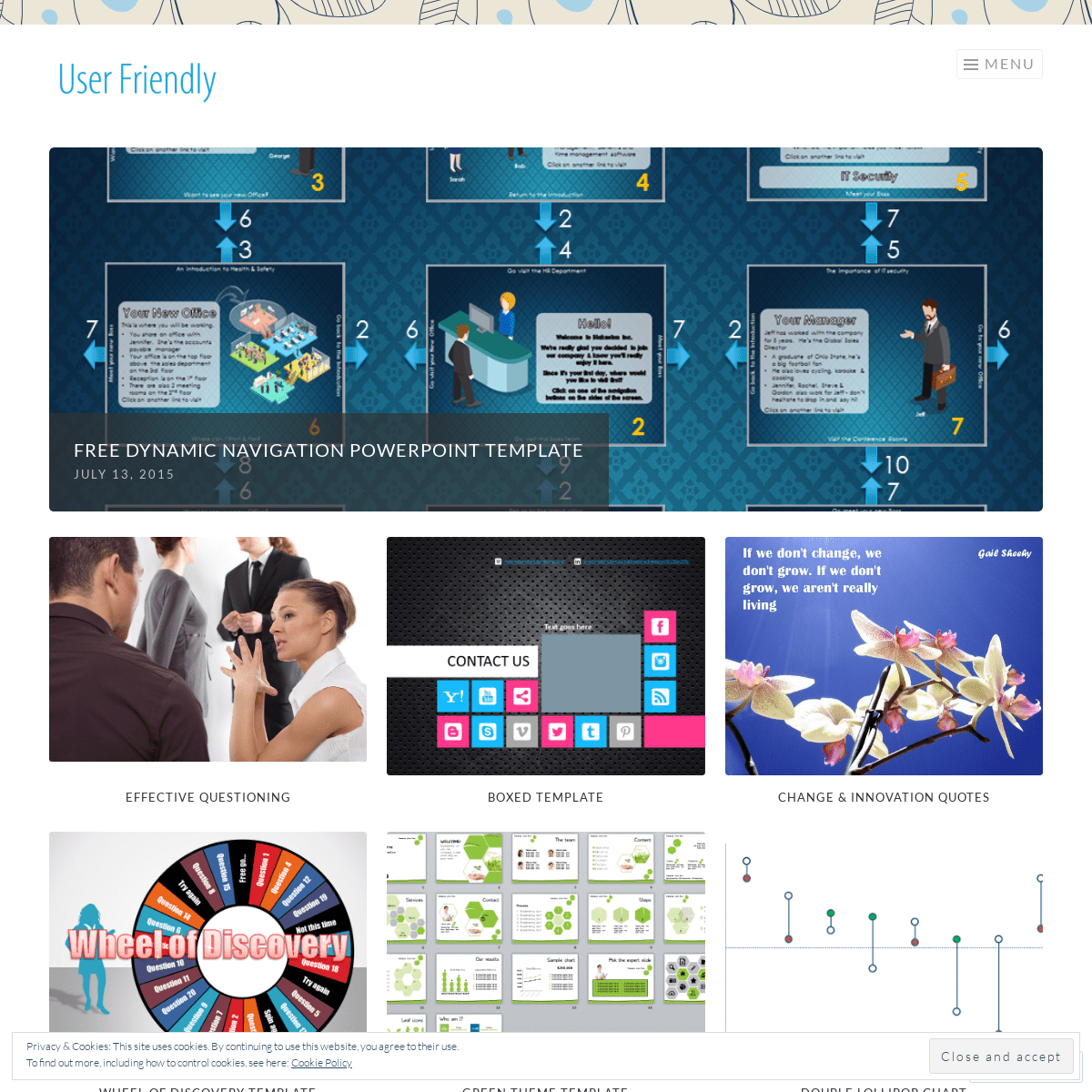
FREE DYNAMIC NAVIGATION POWERPOINT TEMPLATE July 13, 2015July 9, 2015|
Alesandra Blakeston
*
USING POWERPOINT LIKE PREZI July 7, 2015July 7, 2015 | Alesandra Blakeston*
HIGHLIGHTING THE DIFFERENCE BETWEEN ACTUAL AND TARGET October 6, 2014July 7, 2015 | Alesandra Blakeston*
WHO AM I: INNOVATION PROGRAM MANAGER May 16, 2014July 7, 2015 | Alesandra Blakeston*
20 EXCEL CHARTS FOR YOUR DASHBOARDS April 24, 2014July 7, 2015 | Alesandra Blakeston*
IMPROV TO IMPROVE YOUR LISTENING SKILLS March 21, 2014July 7, 2015 | Alesandra Blakeston*
CREATIVITY QUOTES BY SVETLANA BILENKINA July 29, 2013July 7, 2015 | Alesandra Blakeston*
METRO UI STYLE POWERPOINT 2010 TEMPLATE June 3, 2013March 20, 2014 | Alesandra Blakeston*
DELEGATION AND ME… April 4, 2013March 25, 2014|
Alesandra Blakeston
*
HOW TO MAKE A GREAT PRESENTATION! March 29, 2013July 7, 2015 | Alesandra Blakeston* Previous
* Next
Effective questioning EFFECTIVE QUESTIONINGBoxed Template
BOXED TEMPLATE
Change & Innovation Quotes CHANGE & INNOVATION QUOTES Wheel of Discovery Template WHEEL OF DISCOVERY TEMPLATE Green Theme Template GREEN THEME TEMPLATE Double Lollipop Chart DOUBLE LOLLIPOP CHARTBCG Matrix Chart
BCG MATRIX CHART
Broken column with a stacked bar chart BROKEN COLUMN WITH A STACKED BAR CHARTTraffic Light Chart
TRAFFIC LIGHT CHART
Create a free website or blog at WordPress.com. Privacy & Cookies: This site uses cookies. By continuing to use this website, you agree to their use. To find out more, including how to control cookies, see here: CookiePolicy
* Follow
*
* User Friendly
* Customize
* Follow
* Sign up
* Log in
* Copy shortlink
* Report this content * Manage subscriptions* Collapse this bar
Report this ad
Details
6