5
More Annotations


1


6
Favourite Annotations


4


6
Text
CONNECTING THE DOTS
As one of Indianapolis’ largest performing arts organizations, the Indiana Repertory Theatre (IRT) is always looking for the most effective ways to fill the more than 900 seats between their two stages across multiple performances. Providing an easy way for season subscribers to renew their seats is a great way to fill seats, and the IRT uses Printing Partners’ variable data technology to PAPER GRAIN DIRECTION Three quick tests to check for grain direction. 1) Tear Test – Take a sheet of paper and tear it horizontally and then vertically. One tear should have been straighter than the other. The tear that was straighter is parallel to the grain, the jagged tear is going across the grain. 2) Bend Test – Take a sheet of paper, bend the paper (don PAPER TYPES EXPLAINED Gloss — gloss coated paper has a high sheen. Gloss papers have less bulk and opacity and are typically less expensive than dull & matte paper of equal thickness. Gloss coatings reduce ink absorption, which give the sheet an excellent color definition. Satin —VARNISH & COATINGS
Varnish. Varnish is essentially ink without pigment and is available in many finishes including gloss, satin and dull. When applied in-line using a regular ink unit in the press, varnish can achieve exact dot-for-dot registration. Varnish manipulates how light reflects or is adsorbed into a sheet. PLACING AN INDESIGN FILE IN AN INDESIGN FILE Using “Package” under the File Menu, InDesign will collect all of the fonts and images used in your documents and place them into a folder that you can then Zip and send to us. We have instructions on line for how to do this, just follow this link. For any questions regarding how to send in your files, please feel free to contact your CMYK VS RGB VS GRAYSCALE Leave them Grayscale for the most accurate color reproduction. CMYK vs RGB. This is where we see the biggest problem, because you can’t tell by looking. But when it comes to printing you will see a color shift if the color space is incorrect. We print everything in CMYK or spot colors, so having your colors and images in the CMYK color space SMOOTH GRADIENTS AND BLENDS IN ILLUSTRATOR CS5 To create a smooth looking Gradient or Blend in Illustrator look to these steps. Blends. If you are using the Blend Tool and you are getting banding, double-click on the Blend Tool in the Tool Palette. This should bring up a dialog box, make sure the pull-down menu is set to Smooth Color. This should eliminate banding caused by the tool. MAJOR PROBLEMS WITH COLOR SHIFTS IN ANY APPLICATION USING A major difference between Adobe CS5 and CS6 is the update in color libraries provided by Pantone. The new Pantone Plus Series (PPS) has created a major issue with shifts in color, resulting in inconsistencies between color in old documents and ones created with the new libraries. Three big changes were made during the creation ROTATE YOUR VIEW IN INDESIGN Once you have set up your document in InDesign, you go to the Pages Tab and click on the thumbnail of the page that is straining your neck. Then from the Pages sub-menu go to Rotate Spread View and select the direction of rotation you need to be able to see the page without being a yoga master. Once you are finished you can remove the rotation WHAT ARE INDICIAS AND HOW DO THEY WORK? An Indicia or Mailing Permit Imprint is a convenient way to pay for postage when you send bulk mail. The post office has specific rules for the types of mail it can be used on, what an indicia says, and where it is placed on the mail piece.CONNECTING THE DOTS
As one of Indianapolis’ largest performing arts organizations, the Indiana Repertory Theatre (IRT) is always looking for the most effective ways to fill the more than 900 seats between their two stages across multiple performances. Providing an easy way for season subscribers to renew their seats is a great way to fill seats, and the IRT uses Printing Partners’ variable data technology to 15 THINGS WE WISH EVERY DESIGNER AND CLIENT KNEW 15 Things we wish every designer and client knew. Photoshop and Illustrator are excellent programs, but they are not designed for creating entire brochures or booklets. Please use a page layout program such as Quark or InDesign. Check your panel sizes. A BASIC FONT INFORMATION AND TERMS There are aspects of Type and Fonts that we overlook daily. In the following article, I hope to explain some of the terms we use on a daily basis. Hopefully, you will find this useful. Setting the definition of font and typeface We will start our look at what the defines Font and Typeface in BROCHURE FOLDING EQUATIONS Designing pieces that fold can be tricky since the panels need to be different sizes to accommodate for the folds. Listed below are the equations to figure panel sizes for nine of the most common folds for both text weight and cover weight stock. A folding guide PDF is available with these same equations and WHY DON’T MY PMS COLORS LOOK RIGHT ON MY PROOF PMS colors are special mixes of colors that are defined by Pantone. These colors are not made up of cyan, magenta, yellow or black. As you know, only in rare instances can you print a PMS color in CMYK and have it match the actual PMS color. The same is true for our proofs. Proofs print on an inkjet printer using CMYK ink. THE PRINTING OF THE DECLARATION OF INDEPENDENCE On July 4, 1776 the United States Congress ordered that the document prepared by the “Committee of Five”, known as the Declaration of Independence be authenticated and printed by John Dunlap of Philadelphia. “And that copies of this declaration be sent to the several assemblies, conventions and committees, or councils of the continental troops; that it be proclaimed in each of the CROP MARKS AND COLOR BARS Crop and bleed marks, those are the straight lines at the corners of your piece. The outer mark indicates bleed, we typically ask for an 1/8 th of an inch. The inner mark is the trim mark, this is where the cutter operator will cut your piece. The bleed area is put there to extend any color that is supposed to be all the way to the edge ofyour
CMYK VS. RGB VS. PMS RGB. RGB color space is used for screens because screens emit light. RGB is an additive color space, meaning that you start with a black screen, add variations of red, green and blue light to create colors; when all are combined, the result is white. RGB color space includes more vibrant colors than CMYK because you’re working with lightDIVISIBLE BY FOUR
Acceptable layout page counts are: 4, 8, 12, 16, 20, 24, 28, etc. Other Bindery methods require page counts be divisible by 2: Wire-O, GBC, Perfect Binding, Tape. Except that sometimes it can be more cost effective to have your page count divisible by 4. It all has to do with how the pages get printed and how the bindery work is engineered. PLEASE DON’T BUILD YOUR FILES IN PRINTER SPREADS Please don’t build your files in printer spreads. Some clients believe that building their electronic files in Printer Spreads helps us get their files to press faster. The truth is, it slows us down. When we set up files for printing we want them in single-page reader spreads. Our impositioning software will take your pages anddistribute
CONNECTING THE DOTS
As one of Indianapolis’ largest performing arts organizations, the Indiana Repertory Theatre (IRT) is always looking for the most effective ways to fill the more than 900 seats between their two stages across multiple performances. Providing an easy way for season subscribers to renew their seats is a great way to fill seats, and the IRT uses Printing Partners’ variable data technology to PAPER GRAIN DIRECTION Three quick tests to check for grain direction. 1) Tear Test – Take a sheet of paper and tear it horizontally and then vertically. One tear should have been straighter than the other. The tear that was straighter is parallel to the grain, the jagged tear is going across the grain. 2) Bend Test – Take a sheet of paper, bend the paper (don PAPER TYPES EXPLAINED Gloss — gloss coated paper has a high sheen. Gloss papers have less bulk and opacity and are typically less expensive than dull & matte paper of equal thickness. Gloss coatings reduce ink absorption, which give the sheet an excellent color definition. Satin —VARNISH & COATINGS
Varnish. Varnish is essentially ink without pigment and is available in many finishes including gloss, satin and dull. When applied in-line using a regular ink unit in the press, varnish can achieve exact dot-for-dot registration. Varnish manipulates how light reflects or is adsorbed into a sheet. PLACING AN INDESIGN FILE IN AN INDESIGN FILE Using “Package” under the File Menu, InDesign will collect all of the fonts and images used in your documents and place them into a folder that you can then Zip and send to us. We have instructions on line for how to do this, just follow this link. For any questions regarding how to send in your files, please feel free to contact your CMYK VS RGB VS GRAYSCALE Leave them Grayscale for the most accurate color reproduction. CMYK vs RGB. This is where we see the biggest problem, because you can’t tell by looking. But when it comes to printing you will see a color shift if the color space is incorrect. We print everything in CMYK or spot colors, so having your colors and images in the CMYK color space SMOOTH GRADIENTS AND BLENDS IN ILLUSTRATOR CS5 To create a smooth looking Gradient or Blend in Illustrator look to these steps. Blends. If you are using the Blend Tool and you are getting banding, double-click on the Blend Tool in the Tool Palette. This should bring up a dialog box, make sure the pull-down menu is set to Smooth Color. This should eliminate banding caused by the tool. MAJOR PROBLEMS WITH COLOR SHIFTS IN ANY APPLICATION USING A major difference between Adobe CS5 and CS6 is the update in color libraries provided by Pantone. The new Pantone Plus Series (PPS) has created a major issue with shifts in color, resulting in inconsistencies between color in old documents and ones created with the new libraries. Three big changes were made during the creation ROTATE YOUR VIEW IN INDESIGN Once you have set up your document in InDesign, you go to the Pages Tab and click on the thumbnail of the page that is straining your neck. Then from the Pages sub-menu go to Rotate Spread View and select the direction of rotation you need to be able to see the page without being a yoga master. Once you are finished you can remove the rotation WHAT ARE INDICIAS AND HOW DO THEY WORK? An Indicia or Mailing Permit Imprint is a convenient way to pay for postage when you send bulk mail. The post office has specific rules for the types of mail it can be used on, what an indicia says, and where it is placed on the mail piece.CONNECTING THE DOTS
As one of Indianapolis’ largest performing arts organizations, the Indiana Repertory Theatre (IRT) is always looking for the most effective ways to fill the more than 900 seats between their two stages across multiple performances. Providing an easy way for season subscribers to renew their seats is a great way to fill seats, and the IRT uses Printing Partners’ variable data technology to PAPER GRAIN DIRECTION Three quick tests to check for grain direction. 1) Tear Test – Take a sheet of paper and tear it horizontally and then vertically. One tear should have been straighter than the other. The tear that was straighter is parallel to the grain, the jagged tear is going across the grain. 2) Bend Test – Take a sheet of paper, bend the paper (don PAPER TYPES EXPLAINED Gloss — gloss coated paper has a high sheen. Gloss papers have less bulk and opacity and are typically less expensive than dull & matte paper of equal thickness. Gloss coatings reduce ink absorption, which give the sheet an excellent color definition. Satin —VARNISH & COATINGS
Varnish. Varnish is essentially ink without pigment and is available in many finishes including gloss, satin and dull. When applied in-line using a regular ink unit in the press, varnish can achieve exact dot-for-dot registration. Varnish manipulates how light reflects or is adsorbed into a sheet. PLACING AN INDESIGN FILE IN AN INDESIGN FILE Using “Package” under the File Menu, InDesign will collect all of the fonts and images used in your documents and place them into a folder that you can then Zip and send to us. We have instructions on line for how to do this, just follow this link. For any questions regarding how to send in your files, please feel free to contact yourCONNECTING THE DOTS
As one of Indianapolis’ largest performing arts organizations, the Indiana Repertory Theatre (IRT) is always looking for the most effective ways to fill the more than 900 seats between their two stages across multiple performances. Providing an easy way for season subscribers to renew their seats is a great way to fill seats, and the IRT uses Printing Partners’ variable data technology to 15 THINGS WE WISH EVERY DESIGNER AND CLIENT KNEW 15 Things we wish every designer and client knew. Photoshop and Illustrator are excellent programs, but they are not designed for creating entire brochures or booklets. Please use a page layout program such as Quark or InDesign. Check your panel sizes. A BASIC FONT INFORMATION AND TERMS There are aspects of Type and Fonts that we overlook daily. In the following article, I hope to explain some of the terms we use on a daily basis. Hopefully, you will find this useful. Setting the definition of font and typeface We will start our look at what the defines Font and Typeface in BROCHURE FOLDING EQUATIONS Designing pieces that fold can be tricky since the panels need to be different sizes to accommodate for the folds. Listed below are the equations to figure panel sizes for nine of the most common folds for both text weight and cover weight stock. A folding guide PDF is available with these same equations and WHY DON’T MY PMS COLORS LOOK RIGHT ON MY PROOF PMS colors are special mixes of colors that are defined by Pantone. These colors are not made up of cyan, magenta, yellow or black. As you know, only in rare instances can you print a PMS color in CMYK and have it match the actual PMS color. The same is true for our proofs. Proofs print on an inkjet printer using CMYK ink. THE PRINTING OF THE DECLARATION OF INDEPENDENCE On July 4, 1776 the United States Congress ordered that the document prepared by the “Committee of Five”, known as the Declaration of Independence be authenticated and printed by John Dunlap of Philadelphia. “And that copies of this declaration be sent to the several assemblies, conventions and committees, or councils of the continental troops; that it be proclaimed in each of the CROP MARKS AND COLOR BARS Crop and bleed marks, those are the straight lines at the corners of your piece. The outer mark indicates bleed, we typically ask for an 1/8 th of an inch. The inner mark is the trim mark, this is where the cutter operator will cut your piece. The bleed area is put there to extend any color that is supposed to be all the way to the edge ofyour
CMYK VS. RGB VS. PMS RGB. RGB color space is used for screens because screens emit light. RGB is an additive color space, meaning that you start with a black screen, add variations of red, green and blue light to create colors; when all are combined, the result is white. RGB color space includes more vibrant colors than CMYK because you’re working with lightDIVISIBLE BY FOUR
Acceptable layout page counts are: 4, 8, 12, 16, 20, 24, 28, etc. Other Bindery methods require page counts be divisible by 2: Wire-O, GBC, Perfect Binding, Tape. Except that sometimes it can be more cost effective to have your page count divisible by 4. It all has to do with how the pages get printed and how the bindery work is engineered. PLEASE DON’T BUILD YOUR FILES IN PRINTER SPREADS Please don’t build your files in printer spreads. Some clients believe that building their electronic files in Printer Spreads helps us get their files to press faster. The truth is, it slows us down. When we set up files for printing we want them in single-page reader spreads. Our impositioning software will take your pages anddistribute
CONNECTING THE DOTS
As one of Indianapolis’ largest performing arts organizations, the Indiana Repertory Theatre (IRT) is always looking for the most effective ways to fill the more than 900 seats between their two stages across multiple performances. Providing an easy way for season subscribers to renew their seats is a great way to fill seats, and the IRT uses Printing Partners’ variable data technology to PAPER GRAIN DIRECTION Three quick tests to check for grain direction. 1) Tear Test – Take a sheet of paper and tear it horizontally and then vertically. One tear should have been straighter than the other. The tear that was straighter is parallel to the grain, the jagged tear is going across the grain. 2) Bend Test – Take a sheet of paper, bend the paper (don PAPER TYPES EXPLAINED Gloss — gloss coated paper has a high sheen. Gloss papers have less bulk and opacity and are typically less expensive than dull & matte paper of equal thickness. Gloss coatings reduce ink absorption, which give the sheet an excellent color definition. Satin — CMYK VS RGB VS GRAYSCALE Leave them Grayscale for the most accurate color reproduction. CMYK vs RGB. This is where we see the biggest problem, because you can’t tell by looking. But when it comes to printing you will see a color shift if the color space is incorrect. We print everything in CMYK or spot colors, so having your colors and images in the CMYK color space PLACING AN INDESIGN FILE IN AN INDESIGN FILE Using “Package” under the File Menu, InDesign will collect all of the fonts and images used in your documents and place them into a folder that you can then Zip and send to us. We have instructions on line for how to do this, just follow this link. For any questions regarding how to send in your files, please feel free to contact your CREATING PDF FILES FOR SPOT COLOR JOBS Quark. In Quark under the Export Layout as PDF, you will select the type of PDF (High Resolution) you want to make and then click on the Options button. Set all of your settings normally, then go under the Color menu and using the Mode drop-down menu select Composite. You will now see your PMS or Spot colors show up in the list of colors. THE APOSTROPHE, PRIME, ACUTE, DOUBLE PRIME, AND QUOTATIONAPOSTROPHE VS QUOTATION MARKAPOSTROPHE QUOTATION MARKAPOSTROPHE BEFORE QUESTION MARKSINGLE APOSTROPHE VS QUOTE MARKSUSING APOSTROPHES AS QUOTATIONMARKS
The Apostrophe, Prime, Acute, Double Prime, and Quotation Mark. These marks that tend to get used interchangeably in our digital world, some of that is the fault of the program being used, but sometimes it isn’t. The Prime symbol is used to show the unit of measure feet. The correct use of the double prime is to indicate the unit of measure WHAT ARE INDICIAS AND HOW DO THEY WORK? An Indicia or Mailing Permit Imprint is a convenient way to pay for postage when you send bulk mail. The post office has specific rules for the types of mail it can be used on, what an indicia says, and where it is placed on the mail piece. ROTATE YOUR VIEW IN INDESIGN Once you have set up your document in InDesign, you go to the Pages Tab and click on the thumbnail of the page that is straining your neck. Then from the Pages sub-menu go to Rotate Spread View and select the direction of rotation you need to be able to see the page without being a yoga master. Once you are finished you can remove the rotation SMOOTH GRADIENTS AND BLENDS IN ILLUSTRATOR CS5 To create a smooth looking Gradient or Blend in Illustrator look to these steps. Blends. If you are using the Blend Tool and you are getting banding, double-click on the Blend Tool in the Tool Palette. This should bring up a dialog box, make sure the pull-down menu is set to Smooth Color. This should eliminate banding caused by the tool.CONNECTING THE DOTS
As one of Indianapolis’ largest performing arts organizations, the Indiana Repertory Theatre (IRT) is always looking for the most effective ways to fill the more than 900 seats between their two stages across multiple performances. Providing an easy way for season subscribers to renew their seats is a great way to fill seats, and the IRT uses Printing Partners’ variable data technology to PAPER GRAIN DIRECTION Three quick tests to check for grain direction. 1) Tear Test – Take a sheet of paper and tear it horizontally and then vertically. One tear should have been straighter than the other. The tear that was straighter is parallel to the grain, the jagged tear is going across the grain. 2) Bend Test – Take a sheet of paper, bend the paper (don PAPER TYPES EXPLAINED Gloss — gloss coated paper has a high sheen. Gloss papers have less bulk and opacity and are typically less expensive than dull & matte paper of equal thickness. Gloss coatings reduce ink absorption, which give the sheet an excellent color definition. Satin — CMYK VS RGB VS GRAYSCALE Leave them Grayscale for the most accurate color reproduction. CMYK vs RGB. This is where we see the biggest problem, because you can’t tell by looking. But when it comes to printing you will see a color shift if the color space is incorrect. We print everything in CMYK or spot colors, so having your colors and images in the CMYK color space PLACING AN INDESIGN FILE IN AN INDESIGN FILE Using “Package” under the File Menu, InDesign will collect all of the fonts and images used in your documents and place them into a folder that you can then Zip and send to us. We have instructions on line for how to do this, just follow this link. For any questions regarding how to send in your files, please feel free to contact your CREATING PDF FILES FOR SPOT COLOR JOBS Quark. In Quark under the Export Layout as PDF, you will select the type of PDF (High Resolution) you want to make and then click on the Options button. Set all of your settings normally, then go under the Color menu and using the Mode drop-down menu select Composite. You will now see your PMS or Spot colors show up in the list of colors. THE APOSTROPHE, PRIME, ACUTE, DOUBLE PRIME, AND QUOTATIONAPOSTROPHE VS QUOTATION MARKAPOSTROPHE QUOTATION MARKAPOSTROPHE BEFORE QUESTION MARKSINGLE APOSTROPHE VS QUOTE MARKSUSING APOSTROPHES AS QUOTATIONMARKS
The Apostrophe, Prime, Acute, Double Prime, and Quotation Mark. These marks that tend to get used interchangeably in our digital world, some of that is the fault of the program being used, but sometimes it isn’t. The Prime symbol is used to show the unit of measure feet. The correct use of the double prime is to indicate the unit of measure WHAT ARE INDICIAS AND HOW DO THEY WORK? An Indicia or Mailing Permit Imprint is a convenient way to pay for postage when you send bulk mail. The post office has specific rules for the types of mail it can be used on, what an indicia says, and where it is placed on the mail piece. ROTATE YOUR VIEW IN INDESIGN Once you have set up your document in InDesign, you go to the Pages Tab and click on the thumbnail of the page that is straining your neck. Then from the Pages sub-menu go to Rotate Spread View and select the direction of rotation you need to be able to see the page without being a yoga master. Once you are finished you can remove the rotation SMOOTH GRADIENTS AND BLENDS IN ILLUSTRATOR CS5 To create a smooth looking Gradient or Blend in Illustrator look to these steps. Blends. If you are using the Blend Tool and you are getting banding, double-click on the Blend Tool in the Tool Palette. This should bring up a dialog box, make sure the pull-down menu is set to Smooth Color. This should eliminate banding caused by the tool. THE APOSTROPHE, PRIME, ACUTE, DOUBLE PRIME, AND QUOTATION The Apostrophe, Prime, Acute, Double Prime, and Quotation Mark. These marks that tend to get used interchangeably in our digital world, some of that is the fault of the program being used, but sometimes it isn’t. The Prime symbol is used to show the unit of measure feet. The correct use of the double prime is to indicate the unit of measure BASIC FONT INFORMATION AND TERMS There are aspects of Type and Fonts that we overlook daily. In the following article, I hope to explain some of the terms we use on a daily basis. Hopefully, you will find this useful. Setting the definition of font and typeface We will start our look at what the defines Font and Typeface in BROCHURE FOLDING EQUATIONS Designing pieces that fold can be tricky since the panels need to be different sizes to accommodate for the folds. Listed below are the equations to figure panel sizes for nine of the most common folds for both text weight and cover weight stock. A folding guide PDF is available with these same equations and TIPS TO LOWER PRINT COSTS Ultimately, the most effective way to get the best price on commercial printing is to talk to your printer as early as possible. Just as every project is unique, so are the options on how to produce them efficiently. Discussing projects early allows us to provide you suggestions and options specific to your project that WHY DON’T MY PMS COLORS LOOK RIGHT ON MY PROOF PMS colors are special mixes of colors that are defined by Pantone. These colors are not made up of cyan, magenta, yellow or black. As you know, only in rare instances can you print a PMS color in CMYK and have it match the actual PMS color. The same is true for our proofs. Proofs print on an inkjet printer using CMYK ink. WORKING WITH TRANSPARENCY PMS (spot) colors are opaque and intended to stand alone when printed. Because the PMS inks are opaque, using them with transparency effects almost always creates an undesired result when printed. The PMS object will either simply not print, or the RIP process will attempt to create a CMYK equivalent, usually resulting in a shift in color. REGISTRATION, BLACK, & RICH BLACK Registration Black is defined as 100% in Cyan, Magenta, Yellow and Black. This color should be used only for crop marks and registration marks. This color is used for marks so they will print clearly on the plates and press, it gives us the ability and the automatic systems on the press to keep the plates aligned as they run through the press. CMYK VS. RGB VS. PMS RGB. RGB color space is used for screens because screens emit light. RGB is an additive color space, meaning that you start with a black screen, add variations of red, green and blue light to create colors; when all are combined, the result is white. RGB color space includes more vibrant colors than CMYK because you’re working with light MAJOR PROBLEMS WITH COLOR SHIFTS IN ANY APPLICATION USING A major difference between Adobe CS5 and CS6 is the update in color libraries provided by Pantone. The new Pantone Plus Series (PPS) has created a major issue with shifts in color, resulting in inconsistencies between color in old documents and ones created with the new libraries. Three big changes were made during the creationDIVISIBLE BY FOUR
Acceptable layout page counts are: 4, 8, 12, 16, 20, 24, 28, etc. Other Bindery methods require page counts be divisible by 2: Wire-O, GBC, Perfect Binding, Tape. Except that sometimes it can be more cost effective to have your page count divisible by 4. It all has to do with how the pages get printed and how the bindery work is engineered.CONNECTING THE DOTS
Printing news, views, tricks and tips brought to you by the folks atPrinting Partners.
Skip to content
* Blog Home
* About
* PrintingPartners.net← Older posts
WHAT IS BLEED?
Posted on July 18, 2018by
Mallory MacDermott
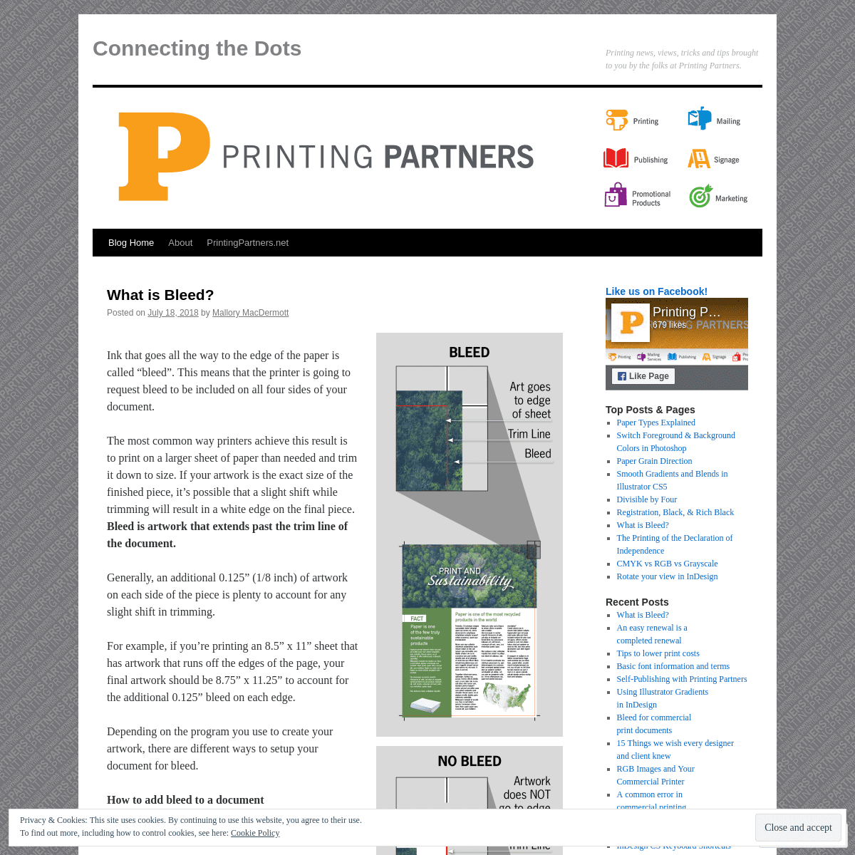
Ink that goes all the way to the edge of the paper is called “bleed”. This means that the printer is going to request bleed to be included on all four sides of your document. The most common way printers achieve this result is to print on a larger sheet of paper than needed and trim it down to size. If your artwork is the exact size of the finished piece, it’s possible that a slight shift while trimming will result in a white edge on the final piece. BLEED IS ARTWORK THAT EXTENDS PAST THE TRIM LINE OF THEDOCUMENT.
Generally, an additional 0.125” (1/8 inch) of artwork on each side of the piece is plenty to account for any slight shift in trimming. For example, if you’re printing an 8.5” x 11” sheet that has artwork that runs off the edges of the page, your final artwork should be 8.75” x 11.25” to account for the additional 0.125” bleed oneach edge.
Depending on the program you use to create your artwork, there are different ways to setup your document for bleed. HOW TO ADD BLEED TO A DOCUMENTADOBE INDESIGN
FOR A NEW DOCUMENT
* Click File > New > Document * Enter the TRIM SIZE of your document * Enter 0.125” in all four of the spaces under Bleed FOR AN EXISTING DOCUMENT * Click File > Document Setup * In the pop-up window, near the bottom, there should be a section called “Bleed & Slug” * Enter 0.125 in in all four of the spaces under Bleed WHEN YOU EXPORT TO PDF * Click File > Export * Set Format to PDF and click Save * In the pop-up window, there is a menu on the left. Go to Marks andBleed.
* Check the box that says “Crop Marks”, set your Offset to 0.125” and check the box that says “Use Document BleedSettings”.
ADOBE PHOTOSHOP
FOR A NEW DOCUMENT
* Click File > New
* Enter the FULL BLEED dimensions (= height + 0.25” and width + 0.25”). This will allow an additional 0.125” around each edge ofthe document.
* Set Resolution to 300 dpi * Set Color Mode to CMYK * If it helps you, once your document is created, you can create guides 0.125” from each edge to visualize your trim lines. FOR AN EXISTING DOCUMENT * Create a new document with the FULL BLEED dimensions. * Create guides 0.125” from each edge of the new document. * Put the new document side-by-side with your original document. * Select all layers in your layers pallet, and drag them into yournew document.
* Use the guides to center your artwork in the document. * Pull any artwork that should run off the edge of the page out to fill the bleed area.ADOBE ILLUSTRATOR
FOR A NEW DOCUMENT
* Click File > New
* Enter the TRIM SIZE of your document * Enter 0.125” in all four of the spaces under Bleed FOR AN EXISTING DOCUMENT * Click File > Document Setup * Enter 0.125” in each space under Bleed WHEN YOU SAVE AS A PDF * Click File > Save As * Set Format to PDF and click Save. * In the pop-up window, there is a menu on the left. Go to Marks andBleed.
* Check the box that says “Trim Marks” and set the Offset to0.125”
* Check the box that says “Use Document Bleed Settings”.Advertisements
Report this ad
Advertisements
Report this ad
RATE THIS:
i
Rate This
SHARE THIS:
*
LIKE THIS:
Like Loading...
Posted in News
| Leave a
comment
AN EASY RENEWAL IS A COMPLETED RENEWAL Posted on April 5, 2018 by Mallory MacDermott As one of Indianapolis’ largest performing arts organizations, the Indiana Repertory Theatre (IRT) is always looking for the most effective ways to fill the more than 900 seats between their two stages across multiple performances. Providing an easy way for season subscribers to renew their seats is a great way to fill seats, and the IRT uses Printing Partners’ variable data technology to do just that. Starting a little more than six months ahead of the season’s first performance, the IRT begins with early bird subscription renewals before the upcoming season’s titles have been announced. The IRT sends personalized letters to each of its subscribers offering the best deal available on pricing with a sneak peak of a few of the titles for the new season. The key to the success of this mailing is how the IRT uses the information they know about their subscribers to customize the letter for each patron to make it both personal and easyto respond.
The IRT supplies Printing Partners with artwork that includes notations of where variable information is to be inserted. The variable information is provided as an excel document with each row containing the data for each subscriber. Printing Partners then generates a unique set of pieces for each subscriber using the data within the Excel document to create the mailing. Here’s a breakdown of the different pieces within the mailing:OUTER ENVELOPE
As the recipient sorts their mail, the outer envelope immediately lets them know what it is, who it’s from, and how long they have to respond. The design — although simple — is very effective in that the most weight is put on the call-to-action to draw the recipient’s eye and invoke immediacy.LETTER FRONT
The letter begins with the recipient’s address and name with salutation. The first couple paragraphs are common for all letters, but the following paragraph(s) change depending on what type of subscription the reader has. Some highlight special benefits that will be new in the upcoming season, others offer a subscription upgrade ata special price.
LETTER BACK
The back of the letter is the order form. Variable data is used to complete the majority of the form, making it as easy as possible for the subscriber to renew. The data contains the subscriber’s name, account number, number of packages, pricing, and seat numbers. Including this data makes it so that all the subscriber needs to do to renew is check a box and complete their payment information. In the case that the subscriber wants to modify their subscription, the options and pricing are clearly detailed in a way that allows the subscriber to make quick selections of their preferences.RESPONSE ENVELOPE
Once the form is completed, the next barrier to overcome is getting it back in the mail. The IRT supplied a business reply envelope to overcome this by making it so that not only does the subscriber have an envelope in-hand, but it’s already addressed and there’s no need for a stamp. The top left corner has a note “URGENT! Process Immediately”, which instructs the IRT to process the contents immediately – but it also reiterates to the subscriber that their response should be sent quickly. Another great tactic worth mentioning about this mailing is that the IRT provided multiple ways for the subscriber to renew their subscription. Aside from mailing in the form, a subscriber can also call, email, or visit in-person to renew their subscription. This mailing is a great example of effective use of variable data printing. This concept can be easily translated to your mailings to create a personal and easy-response vehicle to meet your objectives.RATE THIS:
i
1 Votes
SHARE THIS:
*
LIKE THIS:
Like Loading...
Posted in News
| Leave a
comment
← Older posts
Older posts
*
LIKE US ON FACEBOOK!*
TOP POSTS & PAGES
* Paper Types Explained * Switch Foreground & Background Colors in Photoshop * Paper Grain Direction * Smooth Gradients and Blends in Illustrator CS5* Divisible by Four
* Registration, Black, & Rich Black* What is Bleed?
* The Printing of the Declaration of Independence * CMYK vs RGB vs Grayscale * Rotate your view in InDesign*
RECENT POSTS
* What is Bleed?
* An easy renewal is a completed renewal * Tips to lower print costs * Basic font information and terms * Self-Publishing with Printing Partners * Using Illustrator Gradients in InDesign * Bleed for commercial print documents * 15 Things we wish every designer and client knew * RGB Images and Your Commercial Printer * A common error in commercial printing * Why don’t my PMS colors look right on my proof? * InDesign CS Keyboard Shortcuts * Digital Printing gets multiple upgrades * Printing Partners involved in events that raise significant funds for local organizations * Show off your FANlanthropy with Brackets for Good! * Brackets For Good Brings Fundraising Madness Nationwide * Heartland Film Festival’s 25th Anniversary Kicks off! * Creativity, spreading its wings * 2016 Brackets for Good Celebration * History is made: USPS Reduced Rates*
CATEGORIES
* Color
* Events
* Mailing
* Marketing
* News
* Personalization / One-to-one Marketing* Printing
* Production & Design Tips* Grammar
* Sustainability
Advertisements
Report this ad
Connecting the Dots
Create a free website or blog at WordPress.com.Post to
Cancel
Privacy & Cookies: This site uses cookies. By continuing to use this website, you agree to their use. To find out more, including how to control cookies, see here: CookiePolicy
* Follow
*
* Connecting the Dots* Customize
* Follow
* Sign up
* Log in
* Report this content * Manage subscriptions* Collapse this bar
%d bloggers like this: Send to Email Address Your Name Your Email AddressCancel
Post was not sent - check your email addresses! Email check failed, please try again Sorry, your blog cannot share posts by email.Details
1