5
More Annotations


6


2
Favourite Annotations


3


3
Text
OH NO TYPE COMPANYFONTSCOLLECTIONSSIGN INCUSTOMBLOGINFO Ohno Fatface Variable — $149. Eckmannpsych — $49. Obviously. Digestive — $129. Ohno Fatface — $149. Demos are available for all fonts. Coniferous — $79. Beastly — $99. Ohno Fatface — $149. FONTS ☠️ OH NO TYPE COMPANY Fonts ☠️ OH no Type Company. Irregardless: Four weights, in Roman & Italic, plus some bonus hearts and stars. $129. Swear: Roman, Italic, and Reverse Italic. Four optical sizes. Six weights. Serif overkill. $499. Compadre: Don’t sweat the small stuff when you have a friend like Compadre. $60. VULF ☠️ OH NO TYPE COMPANY Vulf Mono is the official typeface of Vulfpeck, a funky four-piece rhythm section from Ann Arbor, Michigan. The typeface draws its main inspiration from 12 Point Light Italic, a font for the IBM Selectric typewriter. Eight styles are included: Light, Regular, Bold, and Black, in both roman and italic. Vulf Sans Light Italic. Format. SWEAR ☠️ OH NO TYPE COMPANY OH no Type Company. 6 weights, 4 optical sizes, 2 italics. a total of 72 styles. familiar flagrancy for your agency. The most conventional of the three constructions that comprise Swear, the Romans follow a historic precedent for contrast. What does that mean? DIGESTIVE ☠️ OH NO TYPE COMPANY Digestive. Styles. Zero One Two Three Four Five Small. The gastrointestinally-named typeface from the avant garde, young French type designer, Jérémy Landes of Studio Triple. The family is comprised of five widths of headline styles. A bonus “Small” optical size is included for—we’re serious about
this—paragraphs.
HOBEAUX ☠️ OH NO TYPE COMPANY Hobeaux. Styles. Black Bold Semibold Regular Light. The original Hobo was an art-nouveau influenced design released in 1910. Over the years, this one-of-a-kind and often maligned typeface slowly degraded with each transition in type technology. In the 1980s, Hobo was one of the first typefaces digitized due mostly to its unique aesthetic and CONIFEROUS ☠️ OH NO TYPE COMPANY Styles. Thin Light Regular Medium Bold Black. Coniferous is based on the signage at American National Forests that say, “National Forest.”. As a kid, on our yearly vacation to Sequoia, that routed yellow script meant we were almost there. Soon, I would be sitting at the craft shack on the lake, deep into an intense lanyard, surroundedby
HOW DO I PUBLISH MY FIRST FONT? ☠️ OH NO TYPE COMPANY The best marketing is a good typeface. With that said, you have to get the word out there. The best way I’ve found to do this is to 1). Be a positive member of the online type and graphic design community, and 2). Actively self-promote. If you’re shy about self-promotion, perhaps the DIY route is not for you. HOBEAUX ROCOCEAUX ☠️ OH NO TYPE COMPANY Hobeaux Rococeaux. Styles. Regular Background Sherman Borders. While working for Photolettering in the seventies, Paul Carlyle designed many famously ornate typefaces. Among them, was the impossibly intricate Carlyle Roccoco. It was love at first sight. I knew a THE PROCESS OF VULF MONO ☠️ OH NO TYPE COMPANY The Process of Vulf Mono. 06•01•18 — Posted in Process. It was Sunday, October 8th, 2015. My roommate and I were making the drive from a dingy Hotel in Rohnert Park, to our apartment in the fog drenched hillside of San Francisco’s Outer Sunset District. Bleary eyed and dizzy from the night before, I lazily opened up my DiscoverWeekly
OH NO TYPE COMPANYFONTSCOLLECTIONSSIGN INCUSTOMBLOGINFO Ohno Fatface Variable — $149. Eckmannpsych — $49. Obviously. Digestive — $129. Ohno Fatface — $149. Demos are available for all fonts. Coniferous — $79. Beastly — $99. Ohno Fatface — $149. FONTS ☠️ OH NO TYPE COMPANY Fonts ☠️ OH no Type Company. Irregardless: Four weights, in Roman & Italic, plus some bonus hearts and stars. $129. Swear: Roman, Italic, and Reverse Italic. Four optical sizes. Six weights. Serif overkill. $499. Compadre: Don’t sweat the small stuff when you have a friend like Compadre. $60. VULF ☠️ OH NO TYPE COMPANY Vulf Mono is the official typeface of Vulfpeck, a funky four-piece rhythm section from Ann Arbor, Michigan. The typeface draws its main inspiration from 12 Point Light Italic, a font for the IBM Selectric typewriter. Eight styles are included: Light, Regular, Bold, and Black, in both roman and italic. Vulf Sans Light Italic. Format. SWEAR ☠️ OH NO TYPE COMPANY OH no Type Company. 6 weights, 4 optical sizes, 2 italics. a total of 72 styles. familiar flagrancy for your agency. The most conventional of the three constructions that comprise Swear, the Romans follow a historic precedent for contrast. What does that mean? DIGESTIVE ☠️ OH NO TYPE COMPANY Digestive. Styles. Zero One Two Three Four Five Small. The gastrointestinally-named typeface from the avant garde, young French type designer, Jérémy Landes of Studio Triple. The family is comprised of five widths of headline styles. A bonus “Small” optical size is included for—we’re serious aboutthis—paragraphs.
HOBEAUX ☠️ OH NO TYPE COMPANY Hobeaux. Styles. Black Bold Semibold Regular Light. The original Hobo was an art-nouveau influenced design released in 1910. Over the years, this one-of-a-kind and often maligned typeface slowly degraded with each transition in type technology. In the 1980s, Hobo was one of the first typefaces digitized due mostly to its unique aesthetic and CONIFEROUS ☠️ OH NO TYPE COMPANY Styles. Thin Light Regular Medium Bold Black. Coniferous is based on the signage at American National Forests that say, “National Forest.”. As a kid, on our yearly vacation to Sequoia, that routed yellow script meant we were almost there. Soon, I would be sitting at the craft shack on the lake, deep into an intense lanyard, surroundedby
HOW DO I PUBLISH MY FIRST FONT? ☠️ OH NO TYPE COMPANY The best marketing is a good typeface. With that said, you have to get the word out there. The best way I’ve found to do this is to 1). Be a positive member of the online type and graphic design community, and 2). Actively self-promote. If you’re shy about self-promotion, perhaps the DIY route is not for you. HOBEAUX ROCOCEAUX ☠️ OH NO TYPE COMPANY Hobeaux Rococeaux. Styles. Regular Background Sherman Borders. While working for Photolettering in the seventies, Paul Carlyle designed many famously ornate typefaces. Among them, was the impossibly intricate Carlyle Roccoco. It was love at first sight. I knew a THE PROCESS OF VULF MONO ☠️ OH NO TYPE COMPANY The Process of Vulf Mono. 06•01•18 — Posted in Process. It was Sunday, October 8th, 2015. My roommate and I were making the drive from a dingy Hotel in Rohnert Park, to our apartment in the fog drenched hillside of San Francisco’s Outer Sunset District. Bleary eyed and dizzy from the night before, I lazily opened up my DiscoverWeekly
ABOUT ☠️ OH NO TYPE COMPANY About ☠️ OH no Type Company. About. Ohno was birthed in 2015, from a deep appreciation for lively typefaces, and simultaneous dissatisfaction and amazement at the current type design landscape. The goal has always been to create quality work that highlights under-appreciated genres, and respects history without reinventing thewheel.
DEGULAR ☠️ OH NO TYPE COMPANY OH no Type Company. From the foundry that → brought you, “Hobeaux” (2015), “Ohno™ Blazeface” (2019), and “Cheee” (2020), comes something with (significantly) less allure. While {most of} the fonts around here scream in desperate need of your peepers’ gaze, Degular aims to fade into the background [like the finestJapanese-made
DIGESTIVE ☠️ OH NO TYPE COMPANY Digestive. Styles. Zero One Two Three Four Five Small. The gastrointestinally-named typeface from the avant garde, young French type designer, Jérémy Landes of Studio Triple. The family is comprised of five widths of headline styles. A bonus “Small” optical size is included for—we’re serious aboutthis—paragraphs.
OBVIOUSLY ☠️ OH NO TYPE COMPANY With all those things in mind, I set out to make Obviously. There are 96 styles for all sorts of feelings. Use it for the nail salon, the laundromat, and the mechanic. Subtlety is for the birds. Let’s communicate OBVIOUSLY. Obviously Compressed Medium. Format. Fit Paragraph. Alignment. CHEEE ☠️ OH NO TYPE COMPANY Cheee. Styles. Stinkhead Chaarleee Kingstreet Smortious Conshred Bingbong Peeenutt Oldskool Pickles Juanito Schemer Jabroni Sticky Shishi Crimer Tomboe Jimbo Wowie Tbone Boogy Oyen Choy Baby Gnat Small. Variable yeast, variable gravity. Cheee Bingbong. OHNO FATFACE ☠️ OH NO TYPE COMPANY OH no Type Company. → Beginning in the (early) 1800s, the Fann Street foundry in London produced a few designs in the brand new genre of “fatfaces.”. They were intended for short words to be printed HUGE, and for this purpose, they worked quite well! → In the 1970s, everything old was new again, but this time the exaggeratedproportions
DRAWING VECTORS FOR TYPE & LETTERING The Right Points. As a rule, it’s a good idea to keep the number of points as small as is necessary. Extraneous points makes everything a huge pain in the ass. 2. In the Right Places. Here’s the first weird vocabulary term you might be unfamiliar with: extrema is the pluralform of extremum.
THE PROCESS OF VULF SANS ☠️ OH NO TYPE COMPANY Step one was simple enough: remove the serifs, and make it proportionally spaced. Gradually, the S turned from an extremely straightforward and balanced design, into something a little heavier on the bottom, smaller on top, with some generous width. The width of the romans were brought to a slightly wider-than-normal place. THE PROCESS OF SWEAR ☠️ OH NO TYPE COMPANY Using swear words intentionally can bring a bit of lightness and humanity to a moment, or put people at ease. Sometimes however they escape in times of frustration, and make people uncomfortable. Maybe this typeface can do the same. The flat brush is a versatile tool, LA TORTILLA FACTORY ☠️ OH NO TYPE COMPANY I was a huge fan of La Tortilla Factory long before I was drawing letters professionally. I loved the warm character of their existing logo. It's truly a family run business, and their was a certain authenticity that the old design provided, but as time went on and their product line expanded, it made sense to redraw the lettering keeping as much warmth as possible, and simply cleaning up the OH NO TYPE COMPANYFONTSCOLLECTIONSSIGN INCUSTOMBLOGINFO OH no Type Co. Retail and custom typefaces. Life’s a thrill, fontsare chill!
FONTS ☠️ OH NO TYPE COMPANY OH no Type Co. Retail and custom typefaces. Life’s a thrill, fontsare chill!
VULF ☠️ OH NO TYPE COMPANY Vulf Mono is the official typeface of Vulfpeck, a funky four-piece rhythm section from Ann Arbor, Michigan. The typeface draws its maininspiration from 12
SWEAR ☠️ OH NO TYPE COMPANY Swear: A 72 style serif family by OH no Type Co. Mild to wild, getyourself styled.
DEGULAR ☠️ OH NO TYPE COMPANY From the foundry that → brought you, “Hobeaux” (2015), “Ohno™ Blazeface” (2019), and “Cheee” (2020), comes something with (significantly) less allure. While {most of} the fonts around here scream in desperate need of your peepers’ gaze, Degular aims to fade into the background . ¶ Degular also OHNO FATFACE ☠️ OH NO TYPE COMPANY → Beginning in the (early) 1800s, the Fann Street foundry in London produced a few designs in the brand new genre of “fatfaces.” They were intended for short words to be printed HUGE, and for this purpose, they worked quite well! CONIFEROUS ☠️ OH NO TYPE COMPANY Coniferous is based on the signage at American National Forests that say, “National Forest.” As a kid, on our yearly vacation to Sequoia, that routed yellow script meant we were almost there. CHEEE ☠️ OH NO TYPE COMPANY OH no Type Co. Retail and custom typefaces. Life’s a thrill, fontsare chill!
HOBEAUX ROCOCEAUX ☠️ OH NO TYPE COMPANY While working for Photolettering in the seventies, Paul Carlyle designed many famously ornate typefaces. Among them, was the impossibly intricate Carlyle Roccoco. HOW DO I PUBLISH MY FIRST FONT? ☠️ OH NO TYPE COMPANY Why do you want to release it? Possible answer: To make money. You should be aware this is a bit unlikely for your first typeface. If money is the reason for you getting in the type business, you should not be in the type business. OH NO TYPE COMPANYFONTSCOLLECTIONSSIGN INCUSTOMBLOGINFO OH no Type Co. Retail and custom typefaces. Life’s a thrill, fontsare chill!
FONTS ☠️ OH NO TYPE COMPANY OH no Type Co. Retail and custom typefaces. Life’s a thrill, fontsare chill!
VULF ☠️ OH NO TYPE COMPANY Vulf Mono is the official typeface of Vulfpeck, a funky four-piece rhythm section from Ann Arbor, Michigan. The typeface draws its maininspiration from 12
SWEAR ☠️ OH NO TYPE COMPANY Swear: A 72 style serif family by OH no Type Co. Mild to wild, getyourself styled.
DEGULAR ☠️ OH NO TYPE COMPANY From the foundry that → brought you, “Hobeaux” (2015), “Ohno™ Blazeface” (2019), and “Cheee” (2020), comes something with (significantly) less allure. While {most of} the fonts around here scream in desperate need of your peepers’ gaze, Degular aims to fade into the background . ¶ Degular also OHNO FATFACE ☠️ OH NO TYPE COMPANY → Beginning in the (early) 1800s, the Fann Street foundry in London produced a few designs in the brand new genre of “fatfaces.” They were intended for short words to be printed HUGE, and for this purpose, they worked quite well! CONIFEROUS ☠️ OH NO TYPE COMPANY Coniferous is based on the signage at American National Forests that say, “National Forest.” As a kid, on our yearly vacation to Sequoia, that routed yellow script meant we were almost there. CHEEE ☠️ OH NO TYPE COMPANY OH no Type Co. Retail and custom typefaces. Life’s a thrill, fontsare chill!
HOBEAUX ROCOCEAUX ☠️ OH NO TYPE COMPANY While working for Photolettering in the seventies, Paul Carlyle designed many famously ornate typefaces. Among them, was the impossibly intricate Carlyle Roccoco. HOW DO I PUBLISH MY FIRST FONT? ☠️ OH NO TYPE COMPANY Why do you want to release it? Possible answer: To make money. You should be aware this is a bit unlikely for your first typeface. If money is the reason for you getting in the type business, you should not be in the type business. DEMO FONTS ☠️ OH NO TYPE COMPANY By using the demo fonts, you are agreeing to use the fonts for testing and experimenting purposes only. View the demo license for details.. Use in student work is permitted, but use by a student in commercial work is not permitted.. Use on social media for personal projects is permitted with an attribution, mention, and compliment.For instance, “I’m using my favorite monospace, Vulf Mono DIGESTIVE ☠️ OH NO TYPE COMPANY The gastrointestinally-named typeface from the avant garde, young French type designer, Jérémy Landes of Studio Triple. The family is comprised of five widths of headline styles. ABOUT ☠️ OH NO TYPE COMPANY Contact. info@ohnotype.co. 4444 Park Boulevard Oakland, California, 94602 United States. Instagram, Twitter, Pinterest, Tumblr, Dribbble, Facebook, YouTube, Medium DEGULAR ☠️ OH NO TYPE COMPANY From the foundry that → brought you, “Hobeaux” (2015), “Ohno™ Blazeface” (2019), and “Cheee” (2020), comes something with (significantly) less allure. While {most of} the fonts around here scream in desperate need of your peepers’ gaze, Degular aims to fade into the background . ¶ Degular also HOBEAUX ☠️ OH NO TYPE COMPANY Hobeaux is a modern revival—an attempt to fix the mistakes, and maintain all the glory that made Hobo the powerhouse it was. Each character was redrawn and spaced from scratch. COVIK ☠️ OH NO TYPE COMPANY Years later Ricky focussed his boundless passion and energy into fine dining. After working in some of the best restaurants in Napa and San Francisco, he packed his bags, and opened an experimental test kitchen in the same garage he grew up skating next to. CONIFEROUS ☠️ OH NO TYPE COMPANY Coniferous is based on the signage at American National Forests that say, “National Forest.” As a kid, on our yearly vacation to Sequoia, that routed yellow script meant we were almost there. HOW TO WRITE SOMEONE’S NAME ON SOMETHING Whether it’s a gift, an envelope, or a sack lunch, at some point in your life, you will have to write someone’s name on something. You will probably love that person, and you will probably want that person to feel a hint of that love simply upon reading their name. THE PROCESS OF DIGESTIVE ☠️ OH NO TYPE COMPANY This is a guest post on the Ohno Blog by our esteemed collaborator, Jérémy Landes of Studio Triple.I first became aware of his work in the pre-Future Fonts days, and I LA TORTILLA FACTORY ☠️ OH NO TYPE COMPANY I was a huge fan of La Tortilla Factory long before I was drawing letters professionally. I loved the warm character of their existing logo. It's truly a family run business, and their was a certain authenticity that the old design provided, but as time went on and their product line expanded, it made sense to redraw the lettering keeping as much warmth as possible, and simply cleaning up the OH NO TYPE COMPANYFONTSCOLLECTIONSSIGN INCUSTOMBLOGINFO Ohno Fatface Variable — $149. Eckmannpsych — $49. Obviously. Digestive — $129. Ohno Fatface — $149. Demos are available for all fonts. Coniferous — $79. Beastly — $99. Ohno Fatface — $149. FONTS ☠️ OH NO TYPE COMPANY Fonts ☠️ OH no Type Company. Irregardless: Four weights, in Roman & Italic, plus some bonus hearts and stars. $129. Swear: Roman, Italic, and Reverse Italic. Four optical sizes. Six weights. Serif overkill. $499. Compadre: Don’t sweat the small stuff when you have a friend like Compadre. $60. VULF ☠️ OH NO TYPE COMPANY Vulf Mono is the official typeface of Vulfpeck, a funky four-piece rhythm section from Ann Arbor, Michigan. The typeface draws its main inspiration from 12 Point Light Italic, a font for the IBM Selectric typewriter. Eight styles are included: Light, Regular, Bold, and Black, in both roman and italic. Vulf Sans Light Italic. Format. SWEAR ☠️ OH NO TYPE COMPANY OH no Type Company. 6 weights, 4 optical sizes, 2 italics. a total of 72 styles. familiar flagrancy for your agency. The most conventional of the three constructions that comprise Swear, the Romans follow a historic precedent for contrast. What does that mean? DEGULAR ☠️ OH NO TYPE COMPANY OH no Type Company. From the foundry that → brought you, “Hobeaux” (2015), “Ohno™ Blazeface” (2019), and “Cheee” (2020), comes something with (significantly) less allure. While {most of} the fonts around here scream in desperate need of your peepers’ gaze, Degular aims to fade into the background [like the finestJapanese-made
DIGESTIVE ☠️ OH NO TYPE COMPANY Digestive. Styles. Zero One Two Three Four Five Small. The gastrointestinally-named typeface from the avant garde, young French type designer, Jérémy Landes of Studio Triple. The family is comprised of five widths of headline styles. A bonus “Small” optical size is included for—we’re serious aboutthis—paragraphs.
HOBEAUX ☠️ OH NO TYPE COMPANY Hobeaux. Styles. Black Bold Semibold Regular Light. The original Hobo was an art-nouveau influenced design released in 1910. Over the years, this one-of-a-kind and often maligned typeface slowly degraded with each transition in type technology. In the 1980s, Hobo was one of the first typefaces digitized due mostly to its unique aesthetic and CONIFEROUS ☠️ OH NO TYPE COMPANY Styles. Thin Light Regular Medium Bold Black. Coniferous is based on the signage at American National Forests that say, “National Forest.”. As a kid, on our yearly vacation to Sequoia, that routed yellow script meant we were almost there. Soon, I would be sitting at the craft shack on the lake, deep into an intense lanyard, surroundedby
CHEEE ☠️ OH NO TYPE COMPANY Cheee. Styles. Stinkhead Chaarleee Kingstreet Smortious Conshred Bingbong Peeenutt Oldskool Pickles Juanito Schemer Jabroni Sticky Shishi Crimer Tomboe Jimbo Wowie Tbone Boogy Oyen Choy Baby Gnat Small. Variable yeast, variable gravity. Cheee Bingbong. HOW DO I PUBLISH MY FIRST FONT? ☠️ OH NO TYPE COMPANY The best marketing is a good typeface. With that said, you have to get the word out there. The best way I’ve found to do this is to 1). Be a positive member of the online type and graphic design community, and 2). Actively self-promote. If you’re shy about self-promotion, perhaps the DIY route is not for you. OH NO TYPE COMPANYFONTSCOLLECTIONSSIGN INCUSTOMBLOGINFO Ohno Fatface Variable — $149. Eckmannpsych — $49. Obviously. Digestive — $129. Ohno Fatface — $149. Demos are available for all fonts. Coniferous — $79. Beastly — $99. Ohno Fatface — $149. FONTS ☠️ OH NO TYPE COMPANY Fonts ☠️ OH no Type Company. Irregardless: Four weights, in Roman & Italic, plus some bonus hearts and stars. $129. Swear: Roman, Italic, and Reverse Italic. Four optical sizes. Six weights. Serif overkill. $499. Compadre: Don’t sweat the small stuff when you have a friend like Compadre. $60. VULF ☠️ OH NO TYPE COMPANY Vulf Mono is the official typeface of Vulfpeck, a funky four-piece rhythm section from Ann Arbor, Michigan. The typeface draws its main inspiration from 12 Point Light Italic, a font for the IBM Selectric typewriter. Eight styles are included: Light, Regular, Bold, and Black, in both roman and italic. Vulf Sans Light Italic. Format. SWEAR ☠️ OH NO TYPE COMPANY OH no Type Company. 6 weights, 4 optical sizes, 2 italics. a total of 72 styles. familiar flagrancy for your agency. The most conventional of the three constructions that comprise Swear, the Romans follow a historic precedent for contrast. What does that mean? DEGULAR ☠️ OH NO TYPE COMPANY OH no Type Company. From the foundry that → brought you, “Hobeaux” (2015), “Ohno™ Blazeface” (2019), and “Cheee” (2020), comes something with (significantly) less allure. While {most of} the fonts around here scream in desperate need of your peepers’ gaze, Degular aims to fade into the background [like the finestJapanese-made
DIGESTIVE ☠️ OH NO TYPE COMPANY Digestive. Styles. Zero One Two Three Four Five Small. The gastrointestinally-named typeface from the avant garde, young French type designer, Jérémy Landes of Studio Triple. The family is comprised of five widths of headline styles. A bonus “Small” optical size is included for—we’re serious aboutthis—paragraphs.
HOBEAUX ☠️ OH NO TYPE COMPANY Hobeaux. Styles. Black Bold Semibold Regular Light. The original Hobo was an art-nouveau influenced design released in 1910. Over the years, this one-of-a-kind and often maligned typeface slowly degraded with each transition in type technology. In the 1980s, Hobo was one of the first typefaces digitized due mostly to its unique aesthetic and CONIFEROUS ☠️ OH NO TYPE COMPANY Styles. Thin Light Regular Medium Bold Black. Coniferous is based on the signage at American National Forests that say, “National Forest.”. As a kid, on our yearly vacation to Sequoia, that routed yellow script meant we were almost there. Soon, I would be sitting at the craft shack on the lake, deep into an intense lanyard, surroundedby
CHEEE ☠️ OH NO TYPE COMPANY Cheee. Styles. Stinkhead Chaarleee Kingstreet Smortious Conshred Bingbong Peeenutt Oldskool Pickles Juanito Schemer Jabroni Sticky Shishi Crimer Tomboe Jimbo Wowie Tbone Boogy Oyen Choy Baby Gnat Small. Variable yeast, variable gravity. Cheee Bingbong. HOW DO I PUBLISH MY FIRST FONT? ☠️ OH NO TYPE COMPANY The best marketing is a good typeface. With that said, you have to get the word out there. The best way I’ve found to do this is to 1). Be a positive member of the online type and graphic design community, and 2). Actively self-promote. If you’re shy about self-promotion, perhaps the DIY route is not for you. DEGULAR ☠️ OH NO TYPE COMPANY OH no Type Company. From the foundry that → brought you, “Hobeaux” (2015), “Ohno™ Blazeface” (2019), and “Cheee” (2020), comes something with (significantly) less allure. While {most of} the fonts around here scream in desperate need of your peepers’ gaze, Degular aims to fade into the background [like the finestJapanese-made
DIGESTIVE ☠️ OH NO TYPE COMPANY Digestive. Styles. Zero One Two Three Four Five Small. The gastrointestinally-named typeface from the avant garde, young French type designer, Jérémy Landes of Studio Triple. The family is comprised of five widths of headline styles. A bonus “Small” optical size is included for—we’re serious aboutthis—paragraphs.
OBVIOUSLY ☠️ OH NO TYPE COMPANY With all those things in mind, I set out to make Obviously. There are 96 styles for all sorts of feelings. Use it for the nail salon, the laundromat, and the mechanic. Subtlety is for the birds. Let’s communicate OBVIOUSLY. Obviously Compressed Medium. Format. Fit Paragraph. Alignment. OHNO BLAZEFACE ☠️ OH NO TYPE COMPANY Ohno Blazeface is a “real” fat fatty of a display serif. Taking a look at the (fatface) genre, I was seeing mostly the same things : №1 an inability to treat problematic letters effectively, & №2 a consistently traditional structure. ¶ I was convinced a fatface could be more chill, and so Ohno Blazeface ECKMANNPSYCH ☠️ OH NO TYPE COMPANY Eckmannpsych. Styles. Small Medium Large. For a while, my psychedelia-infused version of Eckmann sat dormant on my hard drive until a friend asked for a customization with a few more letters. I was happy to oblige, and even made a little animation for a projectthat
COVIK ☠️ OH NO TYPE COMPANY Covik Sans started as Covik, my graduation project in TypeMedia, a one year bootcamp for type design in The Netherlands. I was hellbent on stretching my comfort zone. I wanted to create a serif for text that would be sober compared to my explorations in expressive display typeand lettering.
DRAWING VECTORS FOR TYPE & LETTERING The Right Points. As a rule, it’s a good idea to keep the number of points as small as is necessary. Extraneous points makes everything a huge pain in the ass. 2. In the Right Places. Here’s the first weird vocabulary term you might be unfamiliar with: extrema is the pluralform of extremum.
THE PROCESS OF VULF MONO ☠️ OH NO TYPE COMPANY The Process of Vulf Mono. 06•01•18 — Posted in Process. It was Sunday, October 8th, 2015. My roommate and I were making the drive from a dingy Hotel in Rohnert Park, to our apartment in the fog drenched hillside of San Francisco’s Outer Sunset District. Bleary eyed and dizzy from the night before, I lazily opened up my DiscoverWeekly
LA TORTILLA FACTORY ☠️ OH NO TYPE COMPANY Initial sketches began played with the existing composition, and altering weight and contrast. Ultimately, we ended up in place quite close to the original. We then explored the difference between drawing corners soft and round (left), versus clear and sharp (right). At this point, the original was an autotrace of a scan of a fax of a smoke THE PROCESS OF VULF SANS ☠️ OH NO TYPE COMPANY Step one was simple enough: remove the serifs, and make it proportionally spaced. Gradually, the S turned from an extremely straightforward and balanced design, into something a little heavier on the bottom, smaller on top, with some generous width. The width of the romans were brought to a slightly wider-than-normal place. OH NO TYPE COMPANYFONTSCOLLECTIONSSIGN INCUSTOMBLOGINFO Ohno Fatface Variable — $149. Eckmannpsych — $49. Obviously. Digestive — $129. Ohno Fatface — $149. Demos are available for all fonts. Coniferous — $79. Beastly — $99. Ohno Fatface — $149. FONTS ☠️ OH NO TYPE COMPANYEASY TYPER OH NOOHNO TYPEOHNO TYPE Fonts ☠️ OH no Type Company. Irregardless: Four weights, in Roman & Italic, plus some bonus hearts and stars. $129. Swear: Roman, Italic, and Reverse Italic. Four optical sizes. Six weights. Serif overkill. $499. Compadre: Don’t sweat the small stuff when you have a friend like Compadre. $60. DEMO FONTS ☠️ OH NO TYPE COMPANYOH NO OH NO SONGSONG LYRICS OH NO OH NOOH NO NO SONGOH NO OH NO SONG 1 HOUROH NO NO NO NO SONGOH NO NOSONG DOWNLOAD
Demo Fonts. By using the demo fonts, you are agreeing to use the fonts for testing and experimenting purposes only. View the demo license for details. Use in student work is permitted, but use by a student in commercial work is not permitted. Use on social media for personal projects is permitted with an attribution, mention, and compliment. VULF ☠️ OH NO TYPE COMPANY Vulf Mono is the official typeface of Vulfpeck, a funky four-piece rhythm section from Ann Arbor, Michigan. The typeface draws its main inspiration from 12 Point Light Italic, a font for the IBM Selectric typewriter. Eight styles are included: Light, Regular, Bold, and Black, in both roman and italic. Vulf Sans Light Italic. Format. SWEAR ☠️ OH NO TYPE COMPANY OH no Type Company. 6 weights, 4 optical sizes, 2 italics. a total of 72 styles. familiar flagrancy for your agency. The most conventional of the three constructions that comprise Swear, the Romans follow a historic precedent for contrast. What does that mean? DIGESTIVE ☠️ OH NO TYPE COMPANYOH NO OH NO SONGSONG LYRICS OH NO OH NOOH NO NO SONGOH NO OH NO SONG 1 HOUROH NO OH NO NO NO ELANCEOH NONO NO NO SONG
Digestive. Styles. Zero One Two Three Four Five Small. The gastrointestinally-named typeface from the avant garde, young French type designer, Jérémy Landes of Studio Triple. The family is comprised of five widths of headline styles. A bonus “Small” optical size is included for—we’re serious aboutthis—paragraphs.
HOBEAUX ☠️ OH NO TYPE COMPANYOH NO OH NO SONGSONG LYRICS OH NO OHNO
Hobeaux. Styles. Black Bold Semibold Regular Light. The original Hobo was an art-nouveau influenced design released in 1910. Over the years, this one-of-a-kind and often maligned typeface slowly degraded with each transition in type technology. In the 1980s, Hobo was one of the first typefaces digitized due mostly to its unique aesthetic and HOW DO I PUBLISH MY FIRST FONT? ☠️ OH NO TYPE COMPANY The best marketing is a good typeface. With that said, you have to get the word out there. The best way I’ve found to do this is to 1). Be a positive member of the online type and graphic design community, and 2). Actively self-promote. If you’re shy about self-promotion, perhaps the DIY route is not for you. HOW TO WRITE SOMEONE’S NAME ON SOMETHING Consider the tool. The chisel sharpie wants to write at about a 1 inch x-height. A standard sharpie could be half that. A ball point pen probably shouldn't go larger than a quarter inch or so. Consider the substrate. These names might look terrible on a tiny 3" × 5" card, and could even be too small on a HOBEAUX ROCOCEAUX ☠️ OH NO TYPE COMPANY Hobeaux Rococeaux. Styles. Regular Background Sherman Borders. While working for Photolettering in the seventies, Paul Carlyle designed many famously ornate typefaces. Among them, was the impossibly intricate Carlyle Roccoco. It was love at first sight. I knew a OH NO TYPE COMPANYFONTSCOLLECTIONSSIGN INCUSTOMBLOGINFO Ohno Fatface Variable — $149. Eckmannpsych — $49. Obviously. Digestive — $129. Ohno Fatface — $149. Demos are available for all fonts. Coniferous — $79. Beastly — $99. Ohno Fatface — $149. FONTS ☠️ OH NO TYPE COMPANYEASY TYPER OH NOOHNO TYPEOHNO TYPE Fonts ☠️ OH no Type Company. Irregardless: Four weights, in Roman & Italic, plus some bonus hearts and stars. $129. Swear: Roman, Italic, and Reverse Italic. Four optical sizes. Six weights. Serif overkill. $499. Compadre: Don’t sweat the small stuff when you have a friend like Compadre. $60. DEMO FONTS ☠️ OH NO TYPE COMPANYOH NO OH NO SONGSONG LYRICS OH NO OH NOOH NO NO SONGOH NO OH NO SONG 1 HOUROH NO NO NO NO SONGOH NO NOSONG DOWNLOAD
Demo Fonts. By using the demo fonts, you are agreeing to use the fonts for testing and experimenting purposes only. View the demo license for details. Use in student work is permitted, but use by a student in commercial work is not permitted. Use on social media for personal projects is permitted with an attribution, mention, and compliment. VULF ☠️ OH NO TYPE COMPANY Vulf Mono is the official typeface of Vulfpeck, a funky four-piece rhythm section from Ann Arbor, Michigan. The typeface draws its main inspiration from 12 Point Light Italic, a font for the IBM Selectric typewriter. Eight styles are included: Light, Regular, Bold, and Black, in both roman and italic. Vulf Sans Light Italic. Format. SWEAR ☠️ OH NO TYPE COMPANY OH no Type Company. 6 weights, 4 optical sizes, 2 italics. a total of 72 styles. familiar flagrancy for your agency. The most conventional of the three constructions that comprise Swear, the Romans follow a historic precedent for contrast. What does that mean? DIGESTIVE ☠️ OH NO TYPE COMPANYOH NO OH NO SONGSONG LYRICS OH NO OH NOOH NO NO SONGOH NO OH NO SONG 1 HOUROH NO OH NO NO NO ELANCEOH NONO NO NO SONG
Digestive. Styles. Zero One Two Three Four Five Small. The gastrointestinally-named typeface from the avant garde, young French type designer, Jérémy Landes of Studio Triple. The family is comprised of five widths of headline styles. A bonus “Small” optical size is included for—we’re serious aboutthis—paragraphs.
HOBEAUX ☠️ OH NO TYPE COMPANYOH NO OH NO SONGSONG LYRICS OH NO OHNO
Hobeaux. Styles. Black Bold Semibold Regular Light. The original Hobo was an art-nouveau influenced design released in 1910. Over the years, this one-of-a-kind and often maligned typeface slowly degraded with each transition in type technology. In the 1980s, Hobo was one of the first typefaces digitized due mostly to its unique aesthetic and HOW DO I PUBLISH MY FIRST FONT? ☠️ OH NO TYPE COMPANY The best marketing is a good typeface. With that said, you have to get the word out there. The best way I’ve found to do this is to 1). Be a positive member of the online type and graphic design community, and 2). Actively self-promote. If you’re shy about self-promotion, perhaps the DIY route is not for you. HOW TO WRITE SOMEONE’S NAME ON SOMETHING Consider the tool. The chisel sharpie wants to write at about a 1 inch x-height. A standard sharpie could be half that. A ball point pen probably shouldn't go larger than a quarter inch or so. Consider the substrate. These names might look terrible on a tiny 3" × 5" card, and could even be too small on a HOBEAUX ROCOCEAUX ☠️ OH NO TYPE COMPANY Hobeaux Rococeaux. Styles. Regular Background Sherman Borders. While working for Photolettering in the seventies, Paul Carlyle designed many famously ornate typefaces. Among them, was the impossibly intricate Carlyle Roccoco. It was love at first sight. I knew a ABOUT ☠️ OH NO TYPE COMPANY About ☠️ OH no Type Company. About. Ohno was birthed in 2015, from a deep appreciation for lively typefaces, and simultaneous dissatisfaction and amazement at the current type design landscape. The goal has always been to create quality work that highlights under-appreciated genres, and respects history without reinventing thewheel.
SIGN IN ☠️ OH NO TYPE COMPANY OH no Type Co. Retail and custom typefaces. Life’s a thrill, fontsare chill!
DIGESTIVE ☠️ OH NO TYPE COMPANY Digestive. Styles. Zero One Two Three Four Five Small. The gastrointestinally-named typeface from the avant garde, young French type designer, Jérémy Landes of Studio Triple. The family is comprised of five widths of headline styles. A bonus “Small” optical size is included for—we’re serious aboutthis—paragraphs.
GETTING STARTED IN TYPE DESIGN ☠️ OH NO TYPE COMPANY The perfect pen (s) Broad nib pens are a must, as so much of (Latin) type history is informed by the broad nib. Within the last ten years or so, Pilot has started manufacturing the refillable Parallel Pens. These are great for a number of reasons: They come in a variety of sizes. They have great flow that is CONIFEROUS ☠️ OH NO TYPE COMPANY Styles. Thin Light Regular Medium Bold Black. Coniferous is based on the signage at American National Forests that say, “National Forest.”. As a kid, on our yearly vacation to Sequoia, that routed yellow script meant we were almost there. Soon, I would be sitting at the craft shack on the lake, deep into an intense lanyard, surroundedby
LA TORTILLA FACTORY ☠️ OH NO TYPE COMPANY I was a huge fan of La Tortilla Factory long before I was drawing letters professionally. I loved the warm character of their existing logo. It's truly a family run business, and their was a certain authenticity that the old design provided, but as time went on and their product line expanded, it made sense to redraw the lettering keeping as much warmth as possible, and simply cleaning up the THE PROCESS OF CHEEE ☠️ OH NO TYPE COMPANY The process with all the Vulf posters was to trace the source typeface in a way that produced some extreme thins. That seemed to not be quite enough in the case of Sintex, so the terminals were rounded as well. The evolution from Sintex to Cheee is a leap, but super simple when thinking about the two steps involved: 1. Increase contrast and 2. THE PROCESS OF ECKMANNPSYCH ☠️ OH NO TYPE COMPANY The Process of Eckmannpsych. Eckmann Schrift was of course originally drawn by Otto Eckmann, but the seeds were planted in 1899 as the masthead for the magazine Die Woche, an illustrated weekly newspaper. Eckmann then translated that lettering into a full typeface, but it seems that type was just a single facet of his many skills. THE PROCESS OF VULF SANS ☠️ OH NO TYPE COMPANY Step one was simple enough: remove the serifs, and make it proportionally spaced. Gradually, the S turned from an extremely straightforward and balanced design, into something a little heavier on the bottom, smaller on top, with some generous width. The width of the romans were brought to a slightly wider-than-normal place. THE PROCESS OF VULF MONO ☠️ OH NO TYPE COMPANY The Process of Vulf Mono. 06•01•18 — Posted in Process. It was Sunday, October 8th, 2015. My roommate and I were making the drive from a dingy Hotel in Rohnert Park, to our apartment in the fog drenched hillside of San Francisco’s Outer Sunset District. Bleary eyed and dizzy from the night before, I lazily opened up my DiscoverWeekly
OH no Type Company.
Fonts
More
Fonts
Collections
Sign In
Info
Demo Fonts
Custom
Merch
Blog
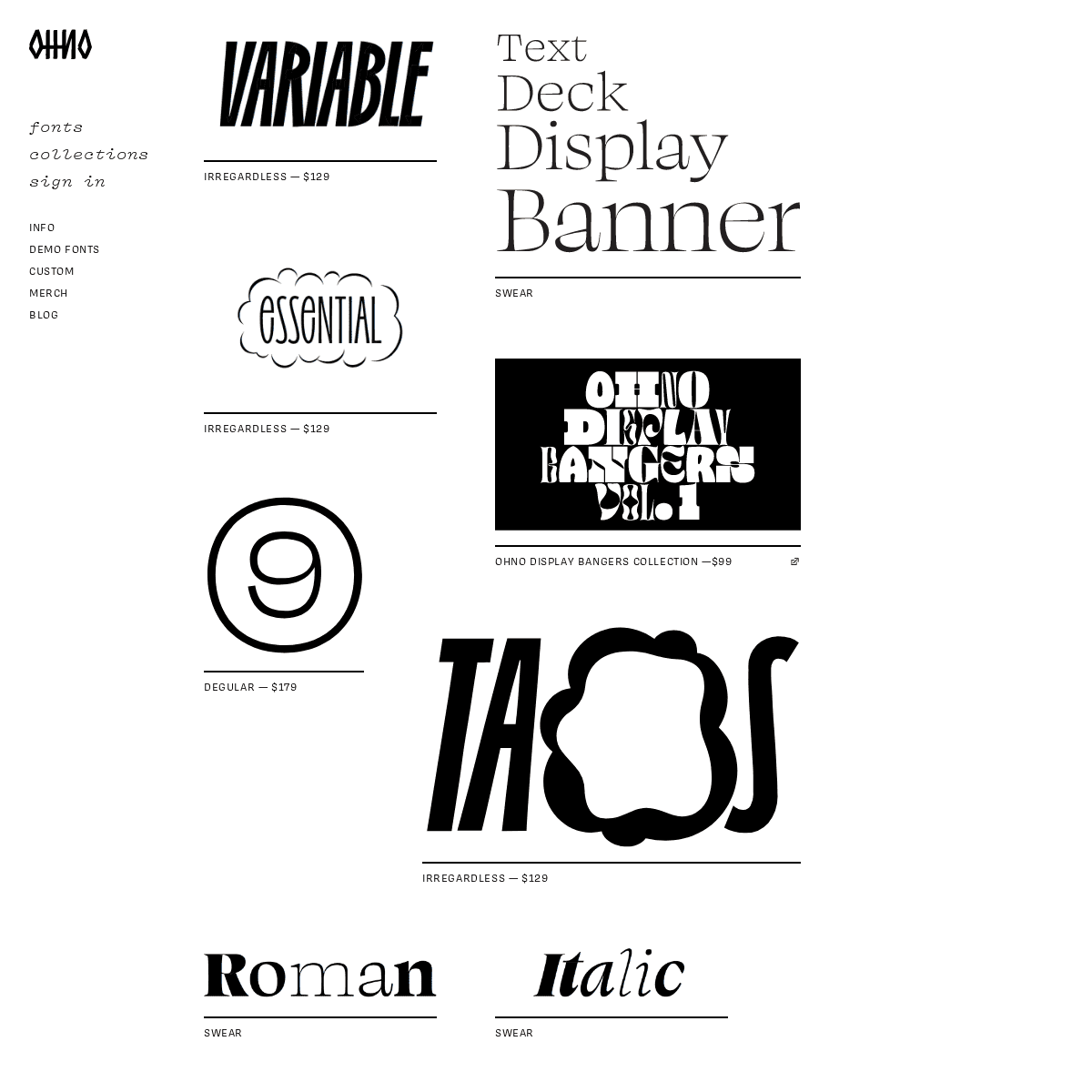
Irregardless — $129Swear
Irregardless — $129 Ohno Display Bangers Collection —$99Degular — $179
Irregardless — $129Swear
Swear
Swear
Irregardless — $129Compadre — $59
Degular Text — $179Swear
Degular — $179
Digestive — $129
Degular Display — $179Swear
Cheee — $99
Degular Display — $179 The Psychedelic Psampler Collection — $99Digestive — $129
Ohno Fatface — $149 Ohno Fatface Variable — $149 Degular Display — $179Obviously
Ohno Fatface — $149Vulf Sans — $55
Degular Display — $179 Ohno Fatface Variable — $149 Eckmannpsych — $49 Ohno Fatface — $149 Sideprojector Collection — $79Digestive — $129
Vulf Sans — $55
Ohno Fatface Variable — $149 Eckmannpsych — $49Obviously
Digestive — $129
Ohno Fatface — $149 Demos are available for all fontsConiferous — $79
Beastly — $99
Ohno Fatface — $149Vulf Sans — $55
Lubalin 100
Digestive — $129
Viktor Script — $79 Ohno Blazeface Available at Future FontsBeastly — $99
Coniferous — $79
Eckmannpsych — $49 Covik Sans Mono — $149 Ohno Fatface — $149Vulf Sans — $55
Miscellaneous Lettering Covik Sans Mono — $149Covik Sans — $179
La Tortilla Factory
Beastly — $99
Vulf Sans — $55
Eckmannpsych — $49Beastly — $99
Cheee Available at Future Fonts Hobeaux Rococeaux — $49 Cheee Available at Future FontsConiferous — $79
Hobeaux — $99
Covik Sans — $179
Vulf Sans — $55
Viktor Script — $79 Covik Sans Mono — $149 Ohno Blazeface — $99Beastly — $99
Ohno Blazeface — $99Vulf Mono — $45
Hobeaux — $99
Vulf Sans — $55
Beastly — $99
CCA MFA Gothic
Ohno Blazeface — $99 Viktor Script — $79Covik Sans — $179
Atlassian
Coniferous — $79
Covik Sans — $179
Vulf Mono — $45
Coniferous — $79
Vulf Mono — $45
Beastly — $99
Vulf Mono — $45
Ohno Blazeface Italic Available at Future FontsHobeaux — $99
Ohno Blazeface — $99Beastly — $99
Covik Sans — $179
Vulf Mono — $45
Cheee Available At Future Fonts Ohno Blazeface — $99Beastly — $99
Covik Sans — $179
Hobeaux Rococeaux — $49Hobeaux — $99
Hobeaux — $99
Covik Sans — $179
Beastly — $99
Vulf Mono — $45
Ohno Blazeface — $99 Hobeaux Rococeaux — $49Vulf Mono — $45
Vulf Mono — $45
Hobeaux — $99
Viktor Script — $79Hobeaux — $99
Ohno Blazeface — $99Hobeaux — $99
Cheee Available At Future FontsBeastly — $99
Eckmannpsych — $49Covik Sans — $179
Beastly — $99
� 2021 OH no Type CompanyDetails
1