5
More Annotations


5


1
Favourite Annotations


1


2
Text
FLOWINGDATAABOUTPROJECTSTUTORIALSCOURSESBECOME A MEMBERLIGHT Data Art / Duc-Quang Nguyen, pixels, R. Here’s a fun interactive by Duc-Quang Nguyen. Upload an image and get back a transformed visual that uses dots, lines, or ascii. Use the menu options to easily change resolution, colors, and shapes. It’s a combination of Georgios Karamanis’s code and Elana Levin Schtulberg’s experiment of the , Google
* Twitter
same
CHART EVERYTHING
Parenting and Work Schedule During the Pandemic. Chart Everything / coronavirus, parenting, time use. Working from home was an ideal that many strived for. For many, it still is, but for those with kids who have to learn from home, the schedule change is less than ideal. MAP OF PEOPLE MOVING DURING PANDEMIC It was only a matter of time before someone showed dots moving across a map to show migration during the pandemic. Again, using USPS change of address data, Yan Wu and Luis Melgar for the Wall Street Journal (paywalled) showed where people moved in the country. As shown through other views, a lot of the movement wasn’t out of the ordinary, but in some areas — mainly San Francisco and DIVORCE RATES AND INCOME DIVORCED. Rates appear to level off around 30 percent. There is less data at higher incomes, so there is more noise. There’s a tight decrease in divorce rate for incomes between $10,000 and $200,000 per year, and then rates seems to flatten out around 30 percent after that. There’s some fluctuation showing in the higher incomes. SEE IF YOU LIVE IN A POLITICAL BUBBLE Gus Wezerek, Ryan D. Enos, and Jacob Brown for NYT Opinion use neighborhood-level data to show how those around you voted in the 2020 election. They ask: do you live in a political bubble? Enter an address to see. This is riffing off of NYT’s similarly-themed map from 2018, which asked the same question but answered moregeographically.
INCOME IN EACH STATE, ADJUSTED FOR COST OF LIVING The chart below uses RPP to show income distributions for each state, unadjusted and adjusted. For example, New York has a relatively high median income, but when you adjust for cost of living, its rank goes down significantly. In contrast, South Dakota ranks in the middle for income, but then rises with adjustment. Income in Each State. MINIMUM WAGE AND COST OF LIVING We already looked at minimum wage over time and saw how some states match the federal limit, some pay above, and others have no limit. But when it comes to geography and income, you also have to consider the cost of living. One dollar in Kentucky or Arkansas won’t get you as much in Hawaii or California, because it costs more to live in thelatter states.
FAST FOOD MENU OF CALORIES In my younger days, I used to eat fast food all of the time. So cheap. So delicious. But these days, it’s all about moderation. My metabolism no longer supports the same amount of fried food. MAKE A FIGURE-GROUND DIAGRAM USING OPENSTREETMAP DATA In visual perception, a figure-ground grouping is where you recognize an object through the background. Think of the vase and two faces image. Hans Hack made a simple tool that lets you make such a diagram using OpenStreetMap data.Select a location in the world, adjust the radius of the circle, provide a label, and voilà, you have yourself aposter.
BOOKS THAT MAKE YOU DUMB (NOT REALLY) Topic. Virgil Griffith has created a series of graphs called Books that Make You Dumb. He correlates top books on FaceBook by school and the corresponding schools’ average SAT scores. Notice Freakonomics is pretty far to the right. Nice. The graphs are of course aren’t really that statistical nor are they especially beautiful, but hey,just
FLOWINGDATAABOUTPROJECTSTUTORIALSCOURSESBECOME A MEMBERLIGHT Data Art / Duc-Quang Nguyen, pixels, R. Here’s a fun interactive by Duc-Quang Nguyen. Upload an image and get back a transformed visual that uses dots, lines, or ascii. Use the menu options to easily change resolution, colors, and shapes. It’s a combination of Georgios Karamanis’s code and Elana Levin Schtulberg’s experiment of thesame
CHART EVERYTHING
Parenting and Work Schedule During the Pandemic. Chart Everything / coronavirus, parenting, time use. Working from home was an ideal that many strived for. For many, it still is, but for those with kids who have to learn from home, the schedule change is less than ideal. MAP OF PEOPLE MOVING DURING PANDEMIC It was only a matter of time before someone showed dots moving across a map to show migration during the pandemic. Again, using USPS change of address data, Yan Wu and Luis Melgar for the Wall Street Journal (paywalled) showed where people moved in the country. As shown through other views, a lot of the movement wasn’t out of the ordinary, but in some areas — mainly San Francisco and DIVORCE RATES AND INCOME DIVORCED. Rates appear to level off around 30 percent. There is less data at higher incomes, so there is more noise. There’s a tight decrease in divorce rate for incomes between $10,000 and $200,000 per year, and then rates seems to flatten out around 30 percent after that. There’s some fluctuation showing in the higher incomes. SEE IF YOU LIVE IN A POLITICAL BUBBLE Gus Wezerek, Ryan D. Enos, and Jacob Brown for NYT Opinion use neighborhood-level data to show how those around you voted in the 2020 election. They ask: do you live in a political bubble? Enter an address to see. This is riffing off of NYT’s similarly-themed map from 2018, which asked the same question but answered moregeographically.
INCOME IN EACH STATE, ADJUSTED FOR COST OF LIVING The chart below uses RPP to show income distributions for each state, unadjusted and adjusted. For example, New York has a relatively high median income, but when you adjust for cost of living, its rank goes down significantly. In contrast, South Dakota ranks in the middle for income, but then rises with adjustment. Income in Each State. MINIMUM WAGE AND COST OF LIVING We already looked at minimum wage over time and saw how some states match the federal limit, some pay above, and others have no limit. But when it comes to geography and income, you also have to consider the cost of living. One dollar in Kentucky or Arkansas won’t get you as much in Hawaii or California, because it costs more to live in thelatter states.
FAST FOOD MENU OF CALORIES In my younger days, I used to eat fast food all of the time. So cheap. So delicious. But these days, it’s all about moderation. My metabolism no longer supports the same amount of fried food. MAKE A FIGURE-GROUND DIAGRAM USING OPENSTREETMAP DATA In visual perception, a figure-ground grouping is where you recognize an object through the background. Think of the vase and two faces image. Hans Hack made a simple tool that lets you make such a diagram using OpenStreetMap data.Select a location in the world, adjust the radius of the circle, provide a label, and voilà, you have yourself aposter.
BOOKS THAT MAKE YOU DUMB (NOT REALLY) Topic. Virgil Griffith has created a series of graphs called Books that Make You Dumb. He correlates top books on FaceBook by school and the corresponding schools’ average SAT scores. Notice Freakonomics is pretty far to the right. Nice. The graphs are of course aren’t really that statistical nor are they especially beautiful, but hey,just
MAPPING GEOGRAPHIC DATA IN R Mapping Geographic Data in R. There are many ways to map geographic data in R, and with all the packages available, it can seem like a hodgepodge of items with no clear spot to begin. This doesn’t have to be the case. With a couple of map-specific packages in hand and some clear goals, you can accomplish the bulk of your mapping tasks.FLOWINGDATA
Prompted by a tweet about scented candles without smell and Covid-19, Kate Petrova plotted Amazon reviews for scented and unscented candles over time. Notice the downward trend for scented candles after the first confirmed case for Covid-19. Interesting if true. I’m imagining a bunch of people opening their new scented candles, taking a big whiff, and not smelling anything. BILLIONAIRE TAX RATES ProPublica anonymously obtained billionaires’ tax returns.Combining the data with Forbes’ billionaire wealth estimates, ProPublica calculated a “true tax rate” for America’s 25 richest people:. The results are stark. According to Forbes, those 25 people saw SEEING HOW MUCH WE ATE OVER THE YEARS Among fresh fruits, apple consumption didn’t change much, but bananas appear to have increased in popularity.Strawberries, grapes, and avocados started towards the bottom but are now higher up in the rankings. Oranges are down significantly. While fresh apples dipped a little, apple juice continues a stead climb in the fruit juice category. . Grapefruit juice, which is the best kind of juice WHO FUNDS THE WORLD HEALTH ORGANIZATION A couple of weeks ago — or maybe it was a couple of years ago, I’m not sure — the administration announced it would withdraw funding from the World Health Organization. Using the two-year budget from 2018-2019, here’s who contributes toSLOW | FLOWINGDATA
1 day ago · If you’ve got it, take the time to understand and explore your data in the places others rushed through.FLOWINGDATA
If you look at gun death rates for other western countries and adjust for population, the United States is a sore-thumb outlier. Kevin Quealy and Margot Sanger-Katz for the Upshot report.FLOWINGDATA
R has found its way into a good number of news groups who do data journalism. Andrew Flowers for FiveThirtyEight talks about how they use the statistical computing language throughout their workflow.. R is used in every step of the data journalism process: for cleaning and processing data, for exploratory graphing and statistical analysis, for models deploying in real time as and to create JOBS THAT MARRY TOGETHER THE MOST Similar patterns appear for manicurists, lawyers, software developers, dentists, chiropractors, pharmacists, chefs, and plenty more. I’m kind of surprised by how much it comes up, even for the more specific occupation titles. On the other hand, the highest pairing rate of 23 percent is between two “other agricultural workers”, which RACE AND ORIGIN IN THE UNITED STATES, BY STATE Survey respondents are allowed to answer more than one race and can have Hispanic or Latino origin or not. For the sake of simplicity, the percentages shown for each race are for those who only selected a single race and are non-Hispanic. Hispanic or Latino is then shown separately for comparison. Looking at percentages is a little tricky FLOWINGDATAABOUTPROJECTSTUTORIALSCOURSESBECOME A MEMBERLIGHT Data Art / Duc-Quang Nguyen, pixels, R. Here’s a fun interactive by Duc-Quang Nguyen. Upload an image and get back a transformed visual that uses dots, lines, or ascii. Use the menu options to easily change resolution, colors, and shapes. It’s a combination of Georgios Karamanis’s code and Elana Levin Schtulberg’s experiment of thesame
SLOW – THE PROCESS 143 17 hours ago · Welcome to issue #143 of The Process, the newsletter for FlowingData members about how the charts get made. I’m Nathan Yau, and this week I’m thinking about taking things slow to work more thoroughly and wander more. ONE DATASET, VISUALIZED 25 WAYS Focus on the the difference between the two sexes, with comparison across countries. Focus on difference between male and female over time. A focus the change between two time periods instead of the fluctuations. Comparison between the two, in a more compact space. Shows changes over time, although not super clear with this dataset. SEE IF YOU LIVE IN A POLITICAL BUBBLE Gus Wezerek, Ryan D. Enos, and Jacob Brown for NYT Opinion use neighborhood-level data to show how those around you voted in the 2020 election. They ask: do you live in a political bubble? Enter an address to see. This is riffing off of NYT’s similarly-themed map from 2018, which asked the same question but answered moregeographically.
DIVORCE RATES AND INCOME DIVORCED. Rates appear to level off around 30 percent. There is less data at higher incomes, so there is more noise. There’s a tight decrease in divorce rate for incomes between $10,000 and $200,000 per year, and then rates seems to flatten out around 30 percent after that. There’s some fluctuation showing in the higher incomes. MOST FEMALE AND MALE OCCUPATIONS SINCE 1950 Between 1950 and 2015, there were 82 occupations out of 459 that flipped from male to female and/or female to male. Out of the 82, 72 shifted from male to female majority. There were 28 occupations that shifted from majority female to male. (Keep in mind that an MINIMUM WAGE AND COST OF LIVING We already looked at minimum wage over time and saw how some states match the federal limit, some pay above, and others have no limit. But when it comes to geography and income, you also have to consider the cost of living. One dollar in Kentucky or Arkansas won’t get you as much in Hawaii or California, because it costs more to live in thelatter states.
WHEN AMERICANS REACH $100K IN SAVINGS When Americans Reach $100k in Savings. By Nathan Yau. There was a statistic going around that said 1 in 6 millennials have at least $100,000 saved. The reactions were mostly confusion and indignation. They were along the lines of, “I don’t know a single millennial with $1,000, much less $100,000.”. Or, “Maybe $100,000 of debt,amirite.”.
WHAT A POUND OF CHANGE IS WORTH Statistics / coins, everyday. After seeing his friend’s CoinStar receipt for 27 pounds of coins that equalled $256.14, Dan Kozikowski dug deeper and estimated what a pound of change is worth, on average. Now, to finish out the analysis, let’s tie this back to weight. Fortunately, the U.S. Mint standardizes and publishes the weight ofeach
COMPARING GGPLOT2 AND R BASE GRAPHICS Especially with visualization. R comes with built-in functionality for charts and graphs, typically referred to as base graphics. Then there are R packages that extend functionality. Although there are many packages, ggplot2 by Hadley Wickham is by far the most popular. These days, people tend to either go by way of base graphics or withggplot2.
FLOWINGDATAABOUTPROJECTSTUTORIALSCOURSESBECOME A MEMBERLIGHT Data Art / Duc-Quang Nguyen, pixels, R. Here’s a fun interactive by Duc-Quang Nguyen. Upload an image and get back a transformed visual that uses dots, lines, or ascii. Use the menu options to easily change resolution, colors, and shapes. It’s a combination of Georgios Karamanis’s code and Elana Levin Schtulberg’s experiment of thesame
SLOW – THE PROCESS 143 17 hours ago · Welcome to issue #143 of The Process, the newsletter for FlowingData members about how the charts get made. I’m Nathan Yau, and this week I’m thinking about taking things slow to work more thoroughly and wander more. ONE DATASET, VISUALIZED 25 WAYS Focus on the the difference between the two sexes, with comparison across countries. Focus on difference between male and female over time. A focus the change between two time periods instead of the fluctuations. Comparison between the two, in a more compact space. Shows changes over time, although not super clear with this dataset. SEE IF YOU LIVE IN A POLITICAL BUBBLE Gus Wezerek, Ryan D. Enos, and Jacob Brown for NYT Opinion use neighborhood-level data to show how those around you voted in the 2020 election. They ask: do you live in a political bubble? Enter an address to see. This is riffing off of NYT’s similarly-themed map from 2018, which asked the same question but answered moregeographically.
DIVORCE RATES AND INCOME DIVORCED. Rates appear to level off around 30 percent. There is less data at higher incomes, so there is more noise. There’s a tight decrease in divorce rate for incomes between $10,000 and $200,000 per year, and then rates seems to flatten out around 30 percent after that. There’s some fluctuation showing in the higher incomes. MOST FEMALE AND MALE OCCUPATIONS SINCE 1950 Between 1950 and 2015, there were 82 occupations out of 459 that flipped from male to female and/or female to male. Out of the 82, 72 shifted from male to female majority. There were 28 occupations that shifted from majority female to male. (Keep in mind that an MINIMUM WAGE AND COST OF LIVING We already looked at minimum wage over time and saw how some states match the federal limit, some pay above, and others have no limit. But when it comes to geography and income, you also have to consider the cost of living. One dollar in Kentucky or Arkansas won’t get you as much in Hawaii or California, because it costs more to live in thelatter states.
WHEN AMERICANS REACH $100K IN SAVINGS When Americans Reach $100k in Savings. By Nathan Yau. There was a statistic going around that said 1 in 6 millennials have at least $100,000 saved. The reactions were mostly confusion and indignation. They were along the lines of, “I don’t know a single millennial with $1,000, much less $100,000.”. Or, “Maybe $100,000 of debt,amirite.”.
WHAT A POUND OF CHANGE IS WORTH Statistics / coins, everyday. After seeing his friend’s CoinStar receipt for 27 pounds of coins that equalled $256.14, Dan Kozikowski dug deeper and estimated what a pound of change is worth, on average. Now, to finish out the analysis, let’s tie this back to weight. Fortunately, the U.S. Mint standardizes and publishes the weight ofeach
COMPARING GGPLOT2 AND R BASE GRAPHICS Especially with visualization. R comes with built-in functionality for charts and graphs, typically referred to as base graphics. Then there are R packages that extend functionality. Although there are many packages, ggplot2 by Hadley Wickham is by far the most popular. These days, people tend to either go by way of base graphics or withggplot2.
BEST DATA VISUALIZATION PROJECTS OF 2020 Best Close-to-Real-Life Visualization of the Virus Spreading How the Virus Got Out. By the end of March, more data was becoming available and it was growing more clear where the SEEING HOW MUCH WE ATE OVER THE YEARS Among fresh fruits, apple consumption didn’t change much, but bananas appear to have increased in popularity.Strawberries, grapes, and avocados started towards the bottom but are now higher up in the rankings. Oranges are down significantly. While fresh apples dipped a little, apple juice continues a stead climb in the fruit juice category. . Grapefruit juice, which is the best kind of juice TAPESTRY FOR REFLECTIVE DATA VISUALIZATION 5 hours ago · As a way to reflect on 2020, Catherine Madden wove tapestry to visualize six time series. So nice.FLOWINGDATA
Prompted by a tweet about scented candles without smell and Covid-19, Kate Petrova plotted Amazon reviews for scented and unscented candles over time. Notice the downward trend for scented candles after the first confirmed case for Covid-19. Interesting if true. I’m imagining a bunch of people opening their new scented candles, taking a big whiff, and not smelling anything. SLOW – THE PROCESS 143 17 hours ago · Welcome to issue #143 of The Process, the newsletter for FlowingData members about how the charts get made. I’m Nathan Yau, and this week I’m thinking about taking things slow to work more thoroughly and wander more. BILLIONAIRE TAX RATES ProPublica anonymously obtained billionaires’ tax returns.Combining the data with Forbes’ billionaire wealth estimates, ProPublica calculated a “true tax rate” for America’s 25 richest people:. The results are stark. According to Forbes, those 25 people sawFLOWINGDATA
The USGS released a unified geologic map of the moon on a 1:5,000,000-scale — and the data to go with it:. This new work represents a seamless, globally consistent, 1:5,000,000-scale geologic map derived from the six digitally renovated geologic maps (see Source Online Linkage below). ALL THE PASSES IN SOCCER VISUALIZED AT ONCE 1 day ago · This is a fun soccer graphic by Karim Douïeb.It shows 882,536 passes from 890 matches across various leagues and seasons. It looks cool as a static point cloud, but be sure to check out the animated, interactive version which lets you isolate the view to specific parts of the field.SLOW | FLOWINGDATA
17 hours ago · If you’ve got it, take the time to understand and explore your data in the places others rushed through.CATHERINE MADDEN
5 hours ago · Become a member. Support an independent site. Make great charts. What you get FLOWINGDATAABOUTPROJECTSTUTORIALSCOURSESBECOME A MEMBERLIGHT Data Art / Duc-Quang Nguyen, pixels, R. Here’s a fun interactive by Duc-Quang Nguyen. Upload an image and get back a transformed visual that uses dots, lines, or ascii. Use the menu options to easily change resolution, colors, and shapes. It’s a combination of Georgios Karamanis’s code and Elana Levin Schtulberg’s experiment of thesame
BEESWARM | CHART TYPES | FLOWINGDATA How I Made That: Interactive Beeswarm Chart to Compare Distributions. The histogram is my favorite chart type, but it's unintuitive for many. So I've been using the less accurate but less abstract beeswarm. MAP OF PEOPLE MOVING DURING PANDEMIC It was only a matter of time before someone showed dots moving across a map to show migration during the pandemic. Again, using USPS change of address data, Yan Wu and Luis Melgar for the Wall Street Journal (paywalled) showed where people moved in the country. As shown through other views, a lot of the movement wasn’t out of the ordinary, but in some areas — mainly San Francisco and PERCENTAGE OF PEOPLE WHO MARRIED, GIVEN YOUR AGE As we’ve learned, women tend to marry at a younger age than men, so the curve shifts downwards as you shift from female to male.. White and Asian people tend to marry more consistently at earlier ages than other groups. Although it’s interesting that the marriage rate approaches the 90s as you get into the older years. YEARS YOU HAVE LEFT TO LIVE, PROBABLY The life expectancy for the average woman in the United States is 81 years and 2 months. For men, it’s 76 years and 5 months. These are the most recent estimates from the Centers for Disease Control and Prevention. Just subtract your current age from those numbers for a rough estimate of how many years you have left. It feels accurate. 5 TIPS FOR LEARNING TO CODE FOR VISUALIZATION Don’t try to optimize in the beginning. Just get the shapes and colors to appear on the screen and encode your data in a way that is visually accurate. If the visualization drags (for the interactive and animated stuff) then optimize. More often than not, your chart will probably be fine without any optimizations. MOST FEMALE AND MALE OCCUPATIONS SINCE 1950 Between 1950 and 2015, there were 82 occupations out of 459 that flipped from male to female and/or female to male. Out of the 82, 72 shifted from male to female majority. There were 28 occupations that shifted from majority female to male. (Keep in mind that an occupation can fluctuate more than once over the years.) WHAT A POUND OF CHANGE IS WORTH Statistics / coins, everyday. After seeing his friend’s CoinStar receipt for 27 pounds of coins that equalled $256.14, Dan Kozikowski dug deeper and estimated what a pound of change is worth, on average. Now, to finish out the analysis, let’s tie this back to weight. Fortunately, the U.S. Mint standardizes and publishes the weight ofeach
DIVORCE RATES FOR DIFFERENT GROUPS It comes from naively dividing the divorce rate by the marriage rate. For example, based on 2014 American Community Survey, 1-year estimates, there were 8.7 divorces and 17.0 marriages per 1,000 women. Divide the former by the latter and you get 51 percent. For men, it was 8.1 and 18.1, respectively, which gives you 45 percent. GOODBYE, MID-RANGE SHOT Goodbye, Mid-Range Shot. There’s a space on the basketball court called “mid-range.”. It’s in between the three-point line and the key (the rectangular area around the basket). You never see players shoot from this “mid-range” area, but it’s actually notoff-limits. In
FLOWINGDATAABOUTPROJECTSTUTORIALSCOURSESBECOME A MEMBERLIGHT Data Art / Duc-Quang Nguyen, pixels, R. Here’s a fun interactive by Duc-Quang Nguyen. Upload an image and get back a transformed visual that uses dots, lines, or ascii. Use the menu options to easily change resolution, colors, and shapes. It’s a combination of Georgios Karamanis’s code and Elana Levin Schtulberg’s experiment of thesame
MAP OF PEOPLE MOVING DURING PANDEMIC It was only a matter of time before someone showed dots moving across a map to show migration during the pandemic. Again, using USPS change of address data, Yan Wu and Luis Melgar for the Wall Street Journal (paywalled) showed where people moved in the country. As shown through other views, a lot of the movement wasn’t out of the ordinary, but in some areas — mainly San Francisco and BEESWARM | CHART TYPES | FLOWINGDATA How I Made That: Interactive Beeswarm Chart to Compare Distributions. The histogram is my favorite chart type, but it's unintuitive for many. So I've been using the less accurate but less abstract beeswarm. PERCENTAGE OF PEOPLE WHO MARRIED, GIVEN YOUR AGE As we’ve learned, women tend to marry at a younger age than men, so the curve shifts downwards as you shift from female to male.. White and Asian people tend to marry more consistently at earlier ages than other groups. Although it’s interesting that the marriage rate approaches the 90s as you get into the older years. YEARS YOU HAVE LEFT TO LIVE, PROBABLY The life expectancy for the average woman in the United States is 81 years and 2 months. For men, it’s 76 years and 5 months. These are the most recent estimates from the Centers for Disease Control and Prevention. Just subtract your current age from those numbers for a rough estimate of how many years you have left. It feels accurate. 5 TIPS FOR LEARNING TO CODE FOR VISUALIZATION Don’t try to optimize in the beginning. Just get the shapes and colors to appear on the screen and encode your data in a way that is visually accurate. If the visualization drags (for the interactive and animated stuff) then optimize. More often than not, your chart will probably be fine without any optimizations. MOST FEMALE AND MALE OCCUPATIONS SINCE 1950 Between 1950 and 2015, there were 82 occupations out of 459 that flipped from male to female and/or female to male. Out of the 82, 72 shifted from male to female majority. There were 28 occupations that shifted from majority female to male. (Keep in mind that an occupation can fluctuate more than once over the years.) WHAT A POUND OF CHANGE IS WORTH Statistics / coins, everyday. After seeing his friend’s CoinStar receipt for 27 pounds of coins that equalled $256.14, Dan Kozikowski dug deeper and estimated what a pound of change is worth, on average. Now, to finish out the analysis, let’s tie this back to weight. Fortunately, the U.S. Mint standardizes and publishes the weight ofeach
DIVORCE RATES FOR DIFFERENT GROUPS It comes from naively dividing the divorce rate by the marriage rate. For example, based on 2014 American Community Survey, 1-year estimates, there were 8.7 divorces and 17.0 marriages per 1,000 women. Divide the former by the latter and you get 51 percent. For men, it was 8.1 and 18.1, respectively, which gives you 45 percent. GOODBYE, MID-RANGE SHOT Goodbye, Mid-Range Shot. There’s a space on the basketball court called “mid-range.”. It’s in between the three-point line and the key (the rectangular area around the basket). You never see players shoot from this “mid-range” area, but it’s actually notoff-limits. In
SEEING HOW MUCH WE ATE OVER THE YEARS 17 hours ago · Among fresh fruits, apple consumption didn’t change much, but bananas appear to have increased in popularity.Strawberries, grapes, and avocados started towards the bottom but are now higher up in the rankings. Oranges are down significantly. While fresh apples dipped a little, apple juice continues a stead climb in the fruit juice category. . Grapefruit juice, which is the best kind of juice SEE IF YOU LIVE IN A POLITICAL BUBBLE Gus Wezerek, Ryan D. Enos, and Jacob Brown for NYT Opinion use neighborhood-level data to show how those around you voted in the 2020 election. They ask: do you live in a political bubble? Enter an address to see. This is riffing off of NYT’s similarly-themed map from 2018, which asked the same question but answered moregeographically.
MONEY-IN-POLITICS NONPROFITS MERGE THEIR DATASETS 1 day ago · Center for Responsive Politics and National Institute on Money in Politics are merging their datasets to make it more accessible:. The nation’s two leading money-in-politics data organizations have joined forces to help Americans hold their leadersaccountable
EVERYDAY EXPERIMENTS Become a member. Support an independent site. Make great charts. Whatyou get
OPENSECRETS
1 day ago · Become a member. Support an independent site. Make great charts. What you get 5 TIPS FOR LEARNING TO CODE FOR VISUALIZATION Don’t try to optimize in the beginning. Just get the shapes and colors to appear on the screen and encode your data in a way that is visually accurate. If the visualization drags (for the interactive and animated stuff) then optimize. More often than not, your chart will probably be fine without any optimizations.ALLUVIAL DIAGRAM
1 day ago · The flow chart type is useful for showing changes over time across categories, especially when order matters. MYTH OF THE ASIAN AMERICAN MODEL MINORITY, EXPLAINED WITH Asian Americans are often viewed as a “model minority”, but when you look, just a little bit closer, the tag doesn’t fit. Connie Hanzhang Jin for NPR breaks it down in a set of six charts.ROCKHOUNDING
1 day ago · Become a member. Support an independent site. Make great charts. What you getFLOWINGDATA
An additional hour of sleep can make a huge difference in how you feel the next day (especially when you have kids).It’s the ability to concentrate for long periods FLOWINGDATAABOUTPROJECTSTUTORIALSCOURSESBECOME A MEMBERLIGHT Data Art / Duc-Quang Nguyen, pixels, R. Here’s a fun interactive by Duc-Quang Nguyen. Upload an image and get back a transformed visual that uses dots, lines, or ascii. Use the menu options to easily change resolution, colors, and shapes. It’s a combination of Georgios Karamanis’s code and Elana Levin Schtulberg’s experiment of thesame
BEESWARM | CHART TYPES | FLOWINGDATA How I Made That: Interactive Beeswarm Chart to Compare Distributions. The histogram is my favorite chart type, but it's unintuitive for many. So I've been using the less accurate but less abstract beeswarm. MAP OF PEOPLE MOVING DURING PANDEMIC It was only a matter of time before someone showed dots moving across a map to show migration during the pandemic. Again, using USPS change of address data, Yan Wu and Luis Melgar for the Wall Street Journal (paywalled) showed where people moved in the country. As shown through other views, a lot of the movement wasn’t out of the ordinary, but in some areas — mainly San Francisco and PERCENTAGE OF PEOPLE WHO MARRIED, GIVEN YOUR AGE As we’ve learned, women tend to marry at a younger age than men, so the curve shifts downwards as you shift from female to male.. White and Asian people tend to marry more consistently at earlier ages than other groups. Although it’s interesting that the marriage rate approaches the 90s as you get into the older years. YEARS YOU HAVE LEFT TO LIVE, PROBABLY The life expectancy for the average woman in the United States is 81 years and 2 months. For men, it’s 76 years and 5 months. These are the most recent estimates from the Centers for Disease Control and Prevention. Just subtract your current age from those numbers for a rough estimate of how many years you have left. It feels accurate. 5 TIPS FOR LEARNING TO CODE FOR VISUALIZATION Don’t try to optimize in the beginning. Just get the shapes and colors to appear on the screen and encode your data in a way that is visually accurate. If the visualization drags (for the interactive and animated stuff) then optimize. More often than not, your chart will probably be fine without any optimizations. MOST FEMALE AND MALE OCCUPATIONS SINCE 1950 Between 1950 and 2015, there were 82 occupations out of 459 that flipped from male to female and/or female to male. Out of the 82, 72 shifted from male to female majority. There were 28 occupations that shifted from majority female to male. (Keep in mind that an occupation can fluctuate more than once over the years.) WHAT A POUND OF CHANGE IS WORTH Statistics / coins, everyday. After seeing his friend’s CoinStar receipt for 27 pounds of coins that equalled $256.14, Dan Kozikowski dug deeper and estimated what a pound of change is worth, on average. Now, to finish out the analysis, let’s tie this back to weight. Fortunately, the U.S. Mint standardizes and publishes the weight ofeach
DIVORCE RATES FOR DIFFERENT GROUPS It comes from naively dividing the divorce rate by the marriage rate. For example, based on 2014 American Community Survey, 1-year estimates, there were 8.7 divorces and 17.0 marriages per 1,000 women. Divide the former by the latter and you get 51 percent. For men, it was 8.1 and 18.1, respectively, which gives you 45 percent. GOODBYE, MID-RANGE SHOT Goodbye, Mid-Range Shot. There’s a space on the basketball court called “mid-range.”. It’s in between the three-point line and the key (the rectangular area around the basket). You never see players shoot from this “mid-range” area, but it’s actually notoff-limits. In
FLOWINGDATAABOUTPROJECTSTUTORIALSCOURSESBECOME A MEMBERLIGHT Data Art / Duc-Quang Nguyen, pixels, R. Here’s a fun interactive by Duc-Quang Nguyen. Upload an image and get back a transformed visual that uses dots, lines, or ascii. Use the menu options to easily change resolution, colors, and shapes. It’s a combination of Georgios Karamanis’s code and Elana Levin Schtulberg’s experiment of thesame
BEESWARM | CHART TYPES | FLOWINGDATA How I Made That: Interactive Beeswarm Chart to Compare Distributions. The histogram is my favorite chart type, but it's unintuitive for many. So I've been using the less accurate but less abstract beeswarm. MAP OF PEOPLE MOVING DURING PANDEMIC It was only a matter of time before someone showed dots moving across a map to show migration during the pandemic. Again, using USPS change of address data, Yan Wu and Luis Melgar for the Wall Street Journal (paywalled) showed where people moved in the country. As shown through other views, a lot of the movement wasn’t out of the ordinary, but in some areas — mainly San Francisco and PERCENTAGE OF PEOPLE WHO MARRIED, GIVEN YOUR AGE As we’ve learned, women tend to marry at a younger age than men, so the curve shifts downwards as you shift from female to male.. White and Asian people tend to marry more consistently at earlier ages than other groups. Although it’s interesting that the marriage rate approaches the 90s as you get into the older years. YEARS YOU HAVE LEFT TO LIVE, PROBABLY The life expectancy for the average woman in the United States is 81 years and 2 months. For men, it’s 76 years and 5 months. These are the most recent estimates from the Centers for Disease Control and Prevention. Just subtract your current age from those numbers for a rough estimate of how many years you have left. It feels accurate. 5 TIPS FOR LEARNING TO CODE FOR VISUALIZATION Don’t try to optimize in the beginning. Just get the shapes and colors to appear on the screen and encode your data in a way that is visually accurate. If the visualization drags (for the interactive and animated stuff) then optimize. More often than not, your chart will probably be fine without any optimizations. MOST FEMALE AND MALE OCCUPATIONS SINCE 1950 Between 1950 and 2015, there were 82 occupations out of 459 that flipped from male to female and/or female to male. Out of the 82, 72 shifted from male to female majority. There were 28 occupations that shifted from majority female to male. (Keep in mind that an occupation can fluctuate more than once over the years.) WHAT A POUND OF CHANGE IS WORTH Statistics / coins, everyday. After seeing his friend’s CoinStar receipt for 27 pounds of coins that equalled $256.14, Dan Kozikowski dug deeper and estimated what a pound of change is worth, on average. Now, to finish out the analysis, let’s tie this back to weight. Fortunately, the U.S. Mint standardizes and publishes the weight ofeach
DIVORCE RATES FOR DIFFERENT GROUPS It comes from naively dividing the divorce rate by the marriage rate. For example, based on 2014 American Community Survey, 1-year estimates, there were 8.7 divorces and 17.0 marriages per 1,000 women. Divide the former by the latter and you get 51 percent. For men, it was 8.1 and 18.1, respectively, which gives you 45 percent. GOODBYE, MID-RANGE SHOT Goodbye, Mid-Range Shot. There’s a space on the basketball court called “mid-range.”. It’s in between the three-point line and the key (the rectangular area around the basket). You never see players shoot from this “mid-range” area, but it’s actually notoff-limits. In
SEEING HOW MUCH WE ATE OVER THE YEARS 4 hours ago · Among fresh fruits, apple consumption didn’t change much, but bananas appear to have increased in popularity.Strawberries, grapes, and avocados started towards the bottom but are now higher up in the rankings. Oranges are down significantly. While fresh apples dipped a little, apple juice continues a stead climb in the fruit juice category. . Grapefruit juice, which is the best kind of juice SEE IF YOU LIVE IN A POLITICAL BUBBLE Gus Wezerek, Ryan D. Enos, and Jacob Brown for NYT Opinion use neighborhood-level data to show how those around you voted in the 2020 election. They ask: do you live in a political bubble? Enter an address to see. This is riffing off of NYT’s similarly-themed map from 2018, which asked the same question but answered moregeographically.
MONEY-IN-POLITICS NONPROFITS MERGE THEIR DATASETS 22 hours ago · Center for Responsive Politics and National Institute on Money in Politics are merging their datasets to make it more accessible:. The nation’s two leading money-in-politics data organizations have joined forces to help Americans hold their leadersaccountable at
EVERYDAY EXPERIMENTS Become a member. Support an independent site. Make great charts. Whatyou get
OPENSECRETS
22 hours ago · Become a member. Support an independent site. Make great charts. What you get 5 TIPS FOR LEARNING TO CODE FOR VISUALIZATION Don’t try to optimize in the beginning. Just get the shapes and colors to appear on the screen and encode your data in a way that is visually accurate. If the visualization drags (for the interactive and animated stuff) then optimize. More often than not, your chart will probably be fine without any optimizations.ALLUVIAL DIAGRAM
13 hours ago · The flow chart type is useful for showing changes over time across categories, especially when order matters. MYTH OF THE ASIAN AMERICAN MODEL MINORITY, EXPLAINED WITH Asian Americans are often viewed as a “model minority”, but when you look, just a little bit closer, the tag doesn’t fit. Connie Hanzhang Jin for NPR breaks it down in a set of six charts.ROCKHOUNDING
1 day ago · Become a member. Support an independent site. Make great charts. What you getFLOWINGDATA
An additional hour of sleep can make a huge difference in how you feel the next day (especially when you have kids).It’s the ability to concentrate for long periods FLOWINGDATAABOUTPROJECTSTUTORIALSCOURSESBECOME A MEMBERLIGHT In 1921, hundreds were killed. The New York Times recreated the neighborhood, adding weight to what happened and showing the loss a hundred years ago:. For decades, what happened in Greenwood was willfully buried in history.Piecing together archival maps and photographs, with guidance from historians, The New York Times constructed a 3D model of the Greenwood neighborhood as it was beforethe
BEESWARM | CHART TYPES | FLOWINGDATA The histogram is my favorite chart type, but it's unintuitive for many. So I've been using the less accurate but less abstract beeswarm. MAP OF PEOPLE MOVING DURING PANDEMIC It was only a matter of time before someone showed dots moving across a map to show migration during the pandemic. Again, using USPS change of address data, Yan Wu and Luis Melgar for the Wall Street Journal (paywalled) showed where people moved in the country. As shown through other views, a lot of the movement wasn’t out of the ordinary, but in some areas — mainly San Francisco and PERCENTAGE OF PEOPLE WHO MARRIED, GIVEN YOUR AGE As we’ve learned, women tend to marry at a younger age than men, so the curve shifts downwards as you shift from female to male.. White and Asian people tend to marry more consistently at earlier ages than other groups. Although it’s interesting that the marriage rate approaches the 90s as you get into the older years. 5 TIPS FOR LEARNING TO CODE FOR VISUALIZATION Here are some tips to get you started, based on my own experiences with R, and more recently, the JavaScript library d3.js. YEARS YOU HAVE LEFT TO LIVE, PROBABLY The life expectancy for the average woman in the United States is 81 years and 2 months. For men, it’s 76 years and 5 months. These are the most recent estimates from the Centers for Disease Control andPrevention.
MOST FEMALE AND MALE OCCUPATIONS SINCE 1950 Decades ago, men went to work and women stayed at home to take care of the home and children. This of course changed a lot. In 1950, a bit over 30 percent of women aged 16 to 64 worked, and just over 80 percent of men in the same age group did. WHAT A POUND OF CHANGE IS WORTH After seeing his friend’s CoinStar receipt for 27 pounds of coins that equalled $256.14, Dan Kozikowski dug deeper and estimated what a pound of change is worth, on average. Now, to finish out the analysis, let’s tie this back to weight. DIVORCE RATES FOR DIFFERENT GROUPS We know when people usually get married.We know who never marries.Finally, it’s time to look at the other side: divorce and remarriage. The chart below shows cumulative rates for different groups of people in the United States, based on 2014 American Community Survey, 1-year estimates. GOODBYE, MID-RANGE SHOT There’s a space on the basketball court called “mid-range.” It’s actually not off-limits. In fact, people used to shoot these so-called “mid-range” shots. FLOWINGDATAABOUTPROJECTSTUTORIALSCOURSESBECOME A MEMBERLIGHT In 1921, hundreds were killed. The New York Times recreated the neighborhood, adding weight to what happened and showing the loss a hundred years ago:. For decades, what happened in Greenwood was willfully buried in history.Piecing together archival maps and photographs, with guidance from historians, The New York Times constructed a 3D model of the Greenwood neighborhood as it was beforethe
BEESWARM | CHART TYPES | FLOWINGDATA The histogram is my favorite chart type, but it's unintuitive for many. So I've been using the less accurate but less abstract beeswarm. MAP OF PEOPLE MOVING DURING PANDEMIC It was only a matter of time before someone showed dots moving across a map to show migration during the pandemic. Again, using USPS change of address data, Yan Wu and Luis Melgar for the Wall Street Journal (paywalled) showed where people moved in the country. As shown through other views, a lot of the movement wasn’t out of the ordinary, but in some areas — mainly San Francisco and PERCENTAGE OF PEOPLE WHO MARRIED, GIVEN YOUR AGE As we’ve learned, women tend to marry at a younger age than men, so the curve shifts downwards as you shift from female to male.. White and Asian people tend to marry more consistently at earlier ages than other groups. Although it’s interesting that the marriage rate approaches the 90s as you get into the older years. 5 TIPS FOR LEARNING TO CODE FOR VISUALIZATION Here are some tips to get you started, based on my own experiences with R, and more recently, the JavaScript library d3.js. YEARS YOU HAVE LEFT TO LIVE, PROBABLY The life expectancy for the average woman in the United States is 81 years and 2 months. For men, it’s 76 years and 5 months. These are the most recent estimates from the Centers for Disease Control andPrevention.
MOST FEMALE AND MALE OCCUPATIONS SINCE 1950 Decades ago, men went to work and women stayed at home to take care of the home and children. This of course changed a lot. In 1950, a bit over 30 percent of women aged 16 to 64 worked, and just over 80 percent of men in the same age group did. WHAT A POUND OF CHANGE IS WORTH After seeing his friend’s CoinStar receipt for 27 pounds of coins that equalled $256.14, Dan Kozikowski dug deeper and estimated what a pound of change is worth, on average. Now, to finish out the analysis, let’s tie this back to weight. DIVORCE RATES FOR DIFFERENT GROUPS We know when people usually get married.We know who never marries.Finally, it’s time to look at the other side: divorce and remarriage. The chart below shows cumulative rates for different groups of people in the United States, based on 2014 American Community Survey, 1-year estimates. GOODBYE, MID-RANGE SHOT There’s a space on the basketball court called “mid-range.” It’s actually not off-limits. In fact, people used to shoot these so-called “mid-range” shots. GUESSING NAMES BASED ON WHAT THEY START WITH I’m really bad at names. A lot of the time when I meet someone new, the name goes in one ear and out the other. If I manage to remember the name short-term, remembering long-term is still a toss-up in favorof forgetting.
MONEY-IN-POLITICS NONPROFITS MERGE THEIR DATASETS 9 hours ago · Center for Responsive Politics and National Institute on Money in Politics are merging their datasets to make it more accessible:. The nation’s two leading money-in-politics data organizations have joined forces to help Americans hold their leadersaccountable
ALLUVIAL DIAGRAM
The flow chart type is useful for showing changes over time across categories, especially when order matters. EVERYDAY EXPERIMENTS Become a member. Support an independent site. Make great charts. Whatyou get
MYTH OF THE ASIAN AMERICAN MODEL MINORITY, EXPLAINED WITH Asian Americans are often viewed as a “model minority”, but when you look, just a little bit closer, the tag doesn’t fit. Connie Hanzhang Jin for NPR breaks it down in a set of six charts.ROCKHOUNDING
17 hours ago · Become a member. Support an independent site. Make great charts. What you get ROCKHOUNDING IN CALIFORNIA Any outdoor activity sounds amazing at this point. Andrea Roberson and Casey Miller for Los Angeles Times put together this charming to rockhounding in California.Each rock type has the tools needed, laws, and where to find it.OPENSECRETS
9 hours ago · Become a member. Support an independent site. Make great charts. What you getFLOWINGDATA
Bloomberg looks at how retail struggles might kill the middle-of-the-road malls before this pandemic is done:. Although many bankrupt retailers continue operating while restructuring under Chapter 11, they’re planning to shut down droves of lower-performingstores.
5 TIPS FOR LEARNING TO CODE FOR VISUALIZATION Here are some tips to get you started, based on my own experiences with R, and more recently, the JavaScript library d3.js.* About
* Projects
* Newsletter
* Membership
* |
* Log In
*
TUTORIALS /
animation , R
, simulation
HOW TO FLATTEN THE CURVE, A SOCIAL DISTANCING SIMULATION AND TUTORIAL Using R, we look at how your decreased interaction with others can help slow the spread of infectious diseases.Read More
*
LAGGING CORONAVIRUS TESTING IN THE USMarch 17, 2020
TOPIC
INFOGRAPHICS
/
coronavirus , New York Times, testing
Coronavirus testing in the United States has been a slow process to say the least. The New York Times shows how test counts contrast against other countries.
There’s some catching up to do.*
POSSIBLE CORONAVIRUS DEATHS COMPARED AGAINST OTHER CAUSESMarch 16, 2020
TOPIC
STATISTICS /
coronavirus , mortality, uncertainty
, Upshot
Based on estimates from public health researcher James Lawler, The Upshot shows the range of coronavirus deaths,
given variable infection and fatality rate. Adjust with the sliders and see how the death count (over a year) compares against other majorcauses of death:
> Dr. Lawler’s estimate, 480,000 deaths, is higher than the number > who die in a year from dementia, emphysema, stroke or diabetes. > There are only two causes of death that kill more Americans: cancer, > which kills just under 600,000 in a year, and heart disease, which > kills around 650,000.>
> A coronavirus death toll near the top of the C.D.C. range (1.7 > million) would mean more deaths from the disease than the number of > Americans typically killed by cancer and heart disease put together. Can we all agree now that brushing off coronavirus by floating annual flu numbers is a bad comparison? The most worrisome part of the data we have is the uncertainty and then the range of possibilities that come out of that uncertainty.*
SIMULATIONS FOR VIRUS SPREAD WITH SOCIAL DISTANCINGMarch 15, 2020
TOPIC
INFOGRAPHICS
/
coronavirus , Harry Stevens, simulation
, social distancing
, Washington Post
Social distancing is the game plan these days. Try to stay at home and avoid contact with others as much as you can. But why? For The Washington Post, Harry Stevens used simplified simulations of animaginary virus
to show how social distancing can flatten the curve.
*
CHANGE IN FOOT TRAFFIC IN OUTBREAK CITIESMarch 13, 2020
TOPIC
INFOGRAPHICS
/
coronavirus , Economist, traffic
From The Economist, this chart shows the (mostly) decrease in foot traffic in major cities with coronavirus outbreaks.
It’s based on data scraped from that section in Google Maps that shows how busy a location is, which I’m kind of surprised the Google limits allowed for. See James Fransham’s threadfor
more details on their process.*
CORONAVIRUS, A VISUAL RUNDOWN – THE PROCESS 080March 12, 2020
TOPIC
THE PROCESS /
coronavirus
_This issue of The Process is public._Hi,
I don’t know about you, but I’ve been finding it hard to concentrate the past week or so. I keep getting guidelines on washing hands and reassurances from the kids’ school that everything is sanitized multiple times per day. There are empty shelves at the stores with toilet paper and hand sanitizer. It all just feels veryuneasy.
And, as I’m sure you heard, the World Health Organization classified Covid-19 as a pandemic.
Naturally, I continued voraciously consuming information about the coronavirus. Here’s a rundown of the useful visuals that have crossed my way. They didn’t help with the uneasiness, but they at least provide a window into what’s happening.Read More
*
A VIEW OF THE CORONAVIRUS OUTBREAK THROUGH DATAMarch 12, 2020
TOPIC
STATISTICAL VISUALIZATION / coronavirus , OurWorld in Data
There’s a lot of figures and numbers floating around about the coronavirus disease. Some conflict with each other and some are from less trustworthy sources. It’s getting tough to filter through. So Our World in Data, which typically offers a view of global progress, has been compiling research and data with links to its sources:
> Most of our work focuses on established problems, for which we can > refer to well-established research and data.>
> COVID-19 is different. All data and research on the virus is > preliminary; researchers are rapidly learning more about a new and > evolving problem. It is certain that the research we present here > will be revised in the future. But based on our mission we feel it > is our role to present clearly what the current research and data > tells us about this emerging problem and especially provide an > understanding of what can and cannot be said based on this available> knowledge.
*
HOW GEARS WORK
March 12, 2020
TOPIC
INFOGRAPHICS
/
Bartosz Ciechanowski, gears
, physics
Bartosz Ciechanowski took a deep dive into how gears work and the physics behind the movement with a series of graphics and interactives:
> I’ve always been fascinated by mechanical gears. There is > something captivating about the way their teeth come together to > create a fluid, unified motion.>
> In this blog post I’d like to look at these simple machines up > close. I’ll explain how gears affect the properties of rotational > motion and how the shape of their teeth is way more sophisticated > than it may initially seem.*
CORONAVIRUS LIFE CYCLEMarch 11, 2020
TOPIC
INFOGRAPHICS
/
Carl Zimmer , coronavirus, Jonathan Corum
, life cycle
, New York Times
For The New York Times, Jonathan Corum and Carl Zimmer describe how the SARS-CoV-2 Coronavirus hijacks your cells,
makes copies of itself, spreads through the body, and infects others. The vertical scrolling provides a clear path from beginning to end of a life cycle, and the color transitions separate various stages.Informative.
Really wishing we could just skip to the end.*
MAP OF ALL THE TREES AND FORESTSMarch 11, 2020
TOPIC
MAPS /
trees
EarthArtAustralia mapped all of the trees and forests in the United States, based on data from researchers Hansen et al.at
the University of Maryland.Read More
*
VISUAL EXPLANATION OF EXPONENTIAL GROWTH AND EPIDEMICSMarch 10, 2020
TOPIC
INFOGRAPHICS
/
3Blue1Brown , math
, video
3Blue1Brown explains exponential growth and epidemics and answers the question of when the curve levels off:*
FLATTEN THE CORONAVIRUS CURVEMarch 9, 2020
TOPIC
STATISTICAL VISUALIZATION / Alexander Radtke, coronavirus
, curves
, health care
, Rosamund Pearce
The coronavirus can possibly infect a lot more people than there are those who can provide medical care. But if we slow the spread, and there are fewer people in need of care at the same time, the difference might be less overbearing. This version of the “flatten the curve” graphic by Alexander Radtke, first madeby
Rosamund Pearce for The Economist, illustrates the difference inanimated form .
*
ALL DATA IS WRONG
March 9, 2020
TOPIC
STATISTICS /
uncertainty , Vicki Boykis Vicki Boykis riffing off the George Box quote,
“All models are wrong, some are useful.”: > The point is that, whatever data you dig into, at any given point in > time, that looks solid on the surface, will be a complete mess > underneath, plagued by undefined values, faulty studies, small > sample problems, plagiarism, and all of the rest of the beautiful > mess that is human life.>
> Just as all deep learning NLP models are really grad students > reading phone books> ,
> if you dig deep enough, you’ll get to a place where your number is > wrong or calculated differently than you’ve assumed. I think of statistics as uncertainty management. It’s about estimates and figuring out how much you can trust them. Working with data is rarely about getting an exact truth.*
DATASET AS WORLDVIEWMarch 9, 2020
TOPIC
STATISTICS / bias, Hannah Davis
Hannah Davis works with machine learning, which relies on an input dataset to build a model of the world. Davis was working with a model for a while before realizing the underlying data was flawed:
> This led to a perspective that has informed all of my work since: a > dataset is a worldview. It encompasses the worldview of the people > who scrape and collect the data, whether they’re researchers, > artists, or companies. It encompasses the worldview of the labelers, > whether they labeled the data manually, unknowingly, or through a > third party service like Mechanical Turk, which comes with its own > demographic biases. It encompasses the worldview of the inherent > taxonomies created by the organizers, which in many cases are > corporations whose motives are directly incompatible with a high > quality of life.*
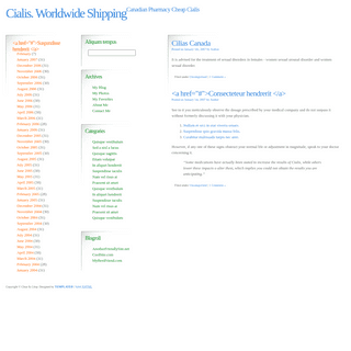
RESPONSIBLE CORONAVIRUS CHARTSMarch 6, 2020
TOPIC
STATISTICAL VISUALIZATION/ coronavirus ,
Datawrapper
Speaking of
responsible visualization, Datawrapper provides 17 charts and maps you can use in your stories, without causing
unnecessary panic.
Below is an embedded example: You can easily edit the charts, download the data, or export as an image file. Datawrapper also describes the sources behind the charts and tips on using them in your stories, making for a solid resource.*
RESPONSIBLE MAPPING
March 6, 2020
TOPIC
DESIGN / cartography, coronavirus
, Kenneth Field
We’re seeing a lot of maps now about coronavirus. There are a lot counts, rates, and a little bit of panic involved. Kenneth Field provides guidance on mapping this data responsibly:
> We’ll focus just on data for China in the following series of > maps. They are designed to look like small maps you might find on a > news media web site. Relatively simple, and with just the basic > facts. Many of the issues I’ll note are equally applicable whether > you’re making a small static map or an interactive web map.*
Members Only
UNCERTAIN – THE PROCESS 079March 5, 2020
TOPIC
THE PROCESS /
uncertainty
These past few weeks, and especially this one, has been full of uncertainty. Probabilities, odds, and rates. In this issue of The Process we talk about ways to visualize this uncertainty.*
MACHINE LEARNING TO HELP YOU NOT TOUCH YOUR FACEMarch 5, 2020
TOPIC
APPS /
coronavirus , face
, machine learning
The CDC recommends that you do not touch your face to minimize the spread of the coronavirus. We do this quite a bit without even thinking about it, so Do Not Touch Your Face uses machine learning to help you adjust. Train the algorithm, and then the algorithm trains you.*
HOW DIFFERENT GROUPS VOTED ON SUPER TUESDAYMarch 4, 2020
TOPIC
INFOGRAPHICS
/
election , Lazaro Gamio, New York Times
, Super Tuesday
The New York Times has a rundown of what happened on Super Tuesday,
with five takeaways. One of the sections uses a ternary plot to show support for Sanders, Biden, and other candidates: In case you’re unfamiliar, a ternary plot shows the ratios of three variables as a single position. In this case, the variables are support for Sanders, Biden, and Other. More support moves a point closer to the respective corner of the triangle.*
CYCLING AND MAPPING ALL THE STREETS IN LONDONMarch 4, 2020
TOPIC
SELF-SURVEILLANCE
/ cycling
, Davis Vilums
, London
Davis Vilums set a goal to cycle every street in London on his way to work (without being late). After four years, he accomplished his goal:
> I am a passionate cyclist, and I love the streets of London. Most of > my travels are daily 25-minute rides to work. Over time my route > became boring. I decided to make it a little bit more interesting by > taking the parallel streets on my way there. I bought a map of > central London and started to colour in the streets to mark the > routes that I have taken. And then I got obsessed with it.* Page 1 of 248
* 1
* 2
* 3
* 4
* 5
* >
FOR MEMBERS
HOW TO FLATTEN THE CURVE, A SOCIAL DISTANCING SIMULATION AND TUTORIAL CORONAVIRUS, A VISUAL RUNDOWN – THE PROCESS 080 UNCERTAIN – THE PROCESS 079✚ THE PROCESS
✚ TUTORIALS
✚ COURSES
BROWSE BY TOPIC
*
VISUALIZATION
Seeing data
*
MAPS
Seeing geographic data*
INFOGRAPHICS
Explaining data
*
NETWORKS
Connecting data
*
STATISTICS
Analyzing data
*
SOFTWARE
Working with data
*
SOURCES
Getting data
*
DESIGN
Making data readable PROJECTS BY FLOWINGDATA*
DATA UNDERLOAD
*
CHART EVERYTHING
*
VISUALIZATION GUIDES*
BOOKS
* About
* Contact
* Newsletter
* RSS
Copyright © 2007-Present FlowingData. All rights reserved.Details
6