6
More Annotations


5


5
Favourite Annotations


5


1
Text
PATTERNS : DESIGNING INTERFACES The complete list. Here are all of the patterns in the second edition of the book, sorted by chapter. Most of these patterns are not online yet, but many of them will
ABOUT THE BOOK
About the Book Designing Interfaces: Patterns for Effective Interaction Design is an intermediate-level book about interface and interaction design, structured as a pattern language. It features real-live examples from desktop applications, web sites, web applications, mobile devices, and ABOUT THE BOOK : DESIGNING INTERFACES About the book. Designing Interfaces: Patterns for Effective Interaction Design is a book about interface and interaction design, structured as a pattern language. It features real-live examples from desktop applications, web sites, web applications, mobile devices, and everything in between. This site contains excerpts from some of thebook
CLEAR ENTRY POINTS
When the site is visited, or the application started, present these entry points as "doors" into the main content of the site or application. From these starting points, guide the user gently and unambiguously into the application until he has enough context to continue by himself. Collectively, these entry points should covermost reasons why
WIZARD : DESIGNING INTERFACESSEE MORE ON DESIGNINGINTERFACES.COM OVERVIEW PLUS DETAIL Make the viewport draggable with the pointer, so users can grab it and slide it around the overview. The detail view shows a magnified "projection" of what's inside the viewport. The two should be synchronized. If the viewport moves, the detail view changes accordingly; if the viewport is made smaller, the magnification shouldincrease.
ALTERNATIVE VIEWS : DESIGNING INTERFACESSEE MORE ON DESIGNINGINTERFACES.COMMOVABLE PANELS
If the movable panels react to mouse clicks or mouse drags, such as for text selection, consider putting a "handle" on each piece that the user can grab to move the piece around. Titlebars are good for this. In fact, if you put an "X" on the handle, some users will concludethat that is
ONE-WINDOW DRILLDOWN : DESIGNING INTERFACESSEE MORE ON DESIGNINGINTERFACES.COM TWO-PANEL SELECTOR : DESIGNING INTERFACESSEE MORE ON DESIGNINGINTERFACES.COM PATTERNS : DESIGNING INTERFACES The complete list. Here are all of the patterns in the second edition of the book, sorted by chapter. Most of these patterns are not online yet, but many of them willABOUT THE BOOK
About the Book Designing Interfaces: Patterns for Effective Interaction Design is an intermediate-level book about interface and interaction design, structured as a pattern language. It features real-live examples from desktop applications, web sites, web applications, mobile devices, and ABOUT THE BOOK : DESIGNING INTERFACES About the book. Designing Interfaces: Patterns for Effective Interaction Design is a book about interface and interaction design, structured as a pattern language. It features real-live examples from desktop applications, web sites, web applications, mobile devices, and everything in between. This site contains excerpts from some of thebook
CLEAR ENTRY POINTS
When the site is visited, or the application started, present these entry points as "doors" into the main content of the site or application. From these starting points, guide the user gently and unambiguously into the application until he has enough context to continue by himself. Collectively, these entry points should covermost reasons why
WIZARD : DESIGNING INTERFACESSEE MORE ON DESIGNINGINTERFACES.COM OVERVIEW PLUS DETAIL Make the viewport draggable with the pointer, so users can grab it and slide it around the overview. The detail view shows a magnified "projection" of what's inside the viewport. The two should be synchronized. If the viewport moves, the detail view changes accordingly; if the viewport is made smaller, the magnification shouldincrease.
ALTERNATIVE VIEWS : DESIGNING INTERFACESSEE MORE ON DESIGNINGINTERFACES.COMMOVABLE PANELS
If the movable panels react to mouse clicks or mouse drags, such as for text selection, consider putting a "handle" on each piece that the user can grab to move the piece around. Titlebars are good for this. In fact, if you put an "X" on the handle, some users will concludethat that is
ONE-WINDOW DRILLDOWN : DESIGNING INTERFACESSEE MORE ON DESIGNINGINTERFACES.COM TWO-PANEL SELECTOR : DESIGNING INTERFACESSEE MORE ON DESIGNINGINTERFACES.COM DESIGNING INTERFACES, SECOND EDITION Designing Interfaces, Second Edition. What’s new in the second edition? Three new chapters, many new and revised patterns, and over 100 new examples. Buy it at Amazon. Read the reviews, too. Read some of the new patterns. Including Picture Manager, Radial Table, and Infinite List. Visit the old site. which will soon be merged with thisnew
ALTERNATIVE VIEWS : DESIGNING INTERFACES Put a “switch” for the mode somewhere on the main interface. It doesn’t have to be prominent; PowerPoint and Word used to put their mode buttons in the lower-left corner, which is an easily overlooked spot on any interface. Most applications represent the alternative views with iconic buttons. Make sure it’s easy to switch back to the WIZARD : DESIGNING INTERFACES The Microsoft Office designers have done away with many of its wizards, but a few remain—and for good reason. Importing data into Excel is a potentially bewildering task. The Import Wizard is an old-school, traditional application wizard with Back/Next buttons, branching, and no sequence map. But it works.MOVABLE PANELS
If the movable panels react to mouse clicks or mouse drags, such as for text selection, consider putting a "handle" on each piece that the user can grab to move the piece around. Titlebars are good for this. In fact, if you put an "X" on the handle, some users will concludethat that is
GLOBAL NAVIGATION
A good global navigation panel is one component of a well-designed Visual Framework (see Chapter 4). To show where the user is now, simply make the link for the current section look different from the others. Use a contrasting color, perhaps, or an unobtrusive graphic like an arrow. One design issue that you may run into, especially onweb
RESPONSIVE DISCLOSURE It was used in 1981 in the first commercial WIMP interface, the Xerox Star. Its designers considered "progressive disclosure," a more general concept that includes responsive disclosure, to be a major design principle: "Progressive disclosure dictates that detail be hidden from users until they ask orACTION PANEL
Putting the action panel on the UI. Set aside a block of space on the interface for the action panel. Place it below or to the side of the target of the action. The target usually is a list, table, or tree of selectable items, but it also might be the Center Stage, like the Powerpoint example in Figure 5-6. Remember that proximity isimportant.
TWO-PANEL SELECTOR : DESIGNING INTERFACES How. Place the selectable list on the top or left panel, and the details panel below it or to its right. This takes advantage of the visual flow that most users who read left-to-right languages will expect (so try reversing it for right-to-left language readers). When the user selects an item, immediately show its contents or details inthe
DIAGONAL BALANCE
Word's Graph Options dialog box ; What: Arrange page elements in an asymmetric fashion, but balance it by putting visual weight into both the upper-left and lower-right corners. ONE-WINDOW DRILLDOWN One-Window Drilldown is an alternative to several of the higher-density patterns and techniques discussed here. As pointed out earlier, Two-Panel Selector may not fit, or it may make the screen layout or interactions too complex for the typical user. Tiled windows, Closable Panels, Movable Panels, and Cascading Lists alsohave space and
PATTERNS : DESIGNING INTERFACES The complete list. Here are all of the patterns in the second edition of the book, sorted by chapter. Most of these patterns are not online yet, but many of them willABOUT THE BOOK
About the Book Designing Interfaces: Patterns for Effective Interaction Design is an intermediate-level book about interface and interaction design, structured as a pattern language. It features real-live examples from desktop applications, web sites, web applications, mobile devices, and ABOUT THE BOOK : DESIGNING INTERFACES About the book. Designing Interfaces: Patterns for Effective Interaction Design is a book about interface and interaction design, structured as a pattern language. It features real-live examples from desktop applications, web sites, web applications, mobile devices, and everything in between. This site contains excerpts from some of thebook
CLEAR ENTRY POINTS
When the site is visited, or the application started, present these entry points as "doors" into the main content of the site or application. From these starting points, guide the user gently and unambiguously into the application until he has enough context to continue by himself. Collectively, these entry points should covermost reasons why
WIZARD : DESIGNING INTERFACESSEE MORE ON DESIGNINGINTERFACES.COM OVERVIEW PLUS DETAIL Make the viewport draggable with the pointer, so users can grab it and slide it around the overview. The detail view shows a magnified "projection" of what's inside the viewport. The two should be synchronized. If the viewport moves, the detail view changes accordingly; if the viewport is made smaller, the magnification shouldincrease.
ALTERNATIVE VIEWS : DESIGNING INTERFACESSEE MORE ON DESIGNINGINTERFACES.COMMOVABLE PANELS
If the movable panels react to mouse clicks or mouse drags, such as for text selection, consider putting a "handle" on each piece that the user can grab to move the piece around. Titlebars are good for this. In fact, if you put an "X" on the handle, some users will concludethat that is
ONE-WINDOW DRILLDOWN : DESIGNING INTERFACESSEE MORE ON DESIGNINGINTERFACES.COM TWO-PANEL SELECTOR : DESIGNING INTERFACESSEE MORE ON DESIGNINGINTERFACES.COM PATTERNS : DESIGNING INTERFACES The complete list. Here are all of the patterns in the second edition of the book, sorted by chapter. Most of these patterns are not online yet, but many of them willABOUT THE BOOK
About the Book Designing Interfaces: Patterns for Effective Interaction Design is an intermediate-level book about interface and interaction design, structured as a pattern language. It features real-live examples from desktop applications, web sites, web applications, mobile devices, and ABOUT THE BOOK : DESIGNING INTERFACES About the book. Designing Interfaces: Patterns for Effective Interaction Design is a book about interface and interaction design, structured as a pattern language. It features real-live examples from desktop applications, web sites, web applications, mobile devices, and everything in between. This site contains excerpts from some of thebook
CLEAR ENTRY POINTS
When the site is visited, or the application started, present these entry points as "doors" into the main content of the site or application. From these starting points, guide the user gently and unambiguously into the application until he has enough context to continue by himself. Collectively, these entry points should covermost reasons why
WIZARD : DESIGNING INTERFACESSEE MORE ON DESIGNINGINTERFACES.COM OVERVIEW PLUS DETAIL Make the viewport draggable with the pointer, so users can grab it and slide it around the overview. The detail view shows a magnified "projection" of what's inside the viewport. The two should be synchronized. If the viewport moves, the detail view changes accordingly; if the viewport is made smaller, the magnification shouldincrease.
ALTERNATIVE VIEWS : DESIGNING INTERFACESSEE MORE ON DESIGNINGINTERFACES.COMMOVABLE PANELS
If the movable panels react to mouse clicks or mouse drags, such as for text selection, consider putting a "handle" on each piece that the user can grab to move the piece around. Titlebars are good for this. In fact, if you put an "X" on the handle, some users will concludethat that is
ONE-WINDOW DRILLDOWN : DESIGNING INTERFACESSEE MORE ON DESIGNINGINTERFACES.COM TWO-PANEL SELECTOR : DESIGNING INTERFACESSEE MORE ON DESIGNINGINTERFACES.COM DESIGNING INTERFACES, SECOND EDITION Designing Interfaces, Second Edition. What’s new in the second edition? Three new chapters, many new and revised patterns, and over 100 new examples. Buy it at Amazon. Read the reviews, too. Read some of the new patterns. Including Picture Manager, Radial Table, and Infinite List. Visit the old site. which will soon be merged with thisnew
ALTERNATIVE VIEWS : DESIGNING INTERFACES Put a “switch” for the mode somewhere on the main interface. It doesn’t have to be prominent; PowerPoint and Word used to put their mode buttons in the lower-left corner, which is an easily overlooked spot on any interface. Most applications represent the alternative views with iconic buttons. Make sure it’s easy to switch back to the WIZARD : DESIGNING INTERFACES The Microsoft Office designers have done away with many of its wizards, but a few remain—and for good reason. Importing data into Excel is a potentially bewildering task. The Import Wizard is an old-school, traditional application wizard with Back/Next buttons, branching, and no sequence map. But it works.MOVABLE PANELS
If the movable panels react to mouse clicks or mouse drags, such as for text selection, consider putting a "handle" on each piece that the user can grab to move the piece around. Titlebars are good for this. In fact, if you put an "X" on the handle, some users will concludethat that is
GLOBAL NAVIGATION
A good global navigation panel is one component of a well-designed Visual Framework (see Chapter 4). To show where the user is now, simply make the link for the current section look different from the others. Use a contrasting color, perhaps, or an unobtrusive graphic like an arrow. One design issue that you may run into, especially onweb
RESPONSIVE DISCLOSURE It was used in 1981 in the first commercial WIMP interface, the Xerox Star. Its designers considered "progressive disclosure," a more general concept that includes responsive disclosure, to be a major design principle: "Progressive disclosure dictates that detail be hidden from users until they ask orACTION PANEL
Putting the action panel on the UI. Set aside a block of space on the interface for the action panel. Place it below or to the side of the target of the action. The target usually is a list, table, or tree of selectable items, but it also might be the Center Stage, like the Powerpoint example in Figure 5-6. Remember that proximity isimportant.
TWO-PANEL SELECTOR : DESIGNING INTERFACES How. Place the selectable list on the top or left panel, and the details panel below it or to its right. This takes advantage of the visual flow that most users who read left-to-right languages will expect (so try reversing it for right-to-left language readers). When the user selects an item, immediately show its contents or details inthe
DIAGONAL BALANCE
Word's Graph Options dialog box ; What: Arrange page elements in an asymmetric fashion, but balance it by putting visual weight into both the upper-left and lower-right corners. ONE-WINDOW DRILLDOWN One-Window Drilldown is an alternative to several of the higher-density patterns and techniques discussed here. As pointed out earlier, Two-Panel Selector may not fit, or it may make the screen layout or interactions too complex for the typical user. Tiled windows, Closable Panels, Movable Panels, and Cascading Lists alsohave space and
PATTERNS : DESIGNING INTERFACES The complete list. Here are all of the patterns in the second edition of the book, sorted by chapter. Most of these patterns are not online yet, but many of them willCLEAR ENTRY POINTS
When the site is visited, or the application started, present these entry points as "doors" into the main content of the site or application. From these starting points, guide the user gently and unambiguously into the application until he has enough context to continue by himself. Collectively, these entry points should covermost reasons why
WIZARD : DESIGNING INTERFACESSEE MORE ON DESIGNINGINTERFACES.COM ALTERNATIVE VIEWS : DESIGNING INTERFACESSEE MORE ON DESIGNINGINTERFACES.COM OVERVIEW PLUS DETAIL Make the viewport draggable with the pointer, so users can grab it and slide it around the overview. The detail view shows a magnified "projection" of what's inside the viewport. The two should be synchronized. If the viewport moves, the detail view changes accordingly; if the viewport is made smaller, the magnification shouldincrease.
CENTER STAGE
Size. The Center Stage content should be at least twice as wide as whatever is in its side margins, and twice as tall as its top and bottom margins. (The user may change its size, but this is how it should be when the user first sees it.) Color. Use a color that contrasts with the information in the margins.MOVABLE PANELS
If the movable panels react to mouse clicks or mouse drags, such as for text selection, consider putting a "handle" on each piece that the user can grab to move the piece around. Titlebars are good for this. In fact, if you put an "X" on the handle, some users will concludethat that is
ONE-WINDOW DRILLDOWN : DESIGNING INTERFACESSEE MORE ON DESIGNINGINTERFACES.COM TWO-PANEL SELECTOR : DESIGNING INTERFACESSEE MORE ON DESIGNINGINTERFACES.COM FAT MENUS : DESIGNING INTERFACESSEE MORE ON DESIGNINGINTERFACES.COM PATTERNS : DESIGNING INTERFACES The complete list. Here are all of the patterns in the second edition of the book, sorted by chapter. Most of these patterns are not online yet, but many of them willCLEAR ENTRY POINTS
When the site is visited, or the application started, present these entry points as "doors" into the main content of the site or application. From these starting points, guide the user gently and unambiguously into the application until he has enough context to continue by himself. Collectively, these entry points should covermost reasons why
WIZARD : DESIGNING INTERFACESSEE MORE ON DESIGNINGINTERFACES.COM ALTERNATIVE VIEWS : DESIGNING INTERFACESSEE MORE ON DESIGNINGINTERFACES.COM OVERVIEW PLUS DETAIL Make the viewport draggable with the pointer, so users can grab it and slide it around the overview. The detail view shows a magnified "projection" of what's inside the viewport. The two should be synchronized. If the viewport moves, the detail view changes accordingly; if the viewport is made smaller, the magnification shouldincrease.
CENTER STAGE
Size. The Center Stage content should be at least twice as wide as whatever is in its side margins, and twice as tall as its top and bottom margins. (The user may change its size, but this is how it should be when the user first sees it.) Color. Use a color that contrasts with the information in the margins.MOVABLE PANELS
If the movable panels react to mouse clicks or mouse drags, such as for text selection, consider putting a "handle" on each piece that the user can grab to move the piece around. Titlebars are good for this. In fact, if you put an "X" on the handle, some users will concludethat that is
ONE-WINDOW DRILLDOWN : DESIGNING INTERFACESSEE MORE ON DESIGNINGINTERFACES.COM TWO-PANEL SELECTOR : DESIGNING INTERFACESSEE MORE ON DESIGNINGINTERFACES.COM FAT MENUS : DESIGNING INTERFACESSEE MORE ON DESIGNINGINTERFACES.COM DESIGNING INTERFACES, SECOND EDITION Designing Interfaces, Second Edition. What’s new in the second edition? Three new chapters, many new and revised patterns, and over 100 new examples. Buy it at Amazon. Read the reviews, too. Read some of the new patterns. Including Picture Manager, Radial Table, and Infinite List. Visit the old site. which will soon be merged with thisnew
PATTERNS : DESIGNING INTERFACES The complete list. Here are all of the patterns in the second edition of the book, sorted by chapter. Most of these patterns are not online yet, but many of them will become available over time as featuredpatterns.
ABOUT PATTERNS
About Patterns. In essence, patterns are structural and behavioral features that improve the "habitability" of something -- a user interface, a Web site, an object-oriented program, or even a building. They make things more usable, easier to understand, or more beautiful; they make tools more ready-to-hand. WIZARD : DESIGNING INTERFACES The Microsoft Office designers have done away with many of its wizards, but a few remain—and for good reason. Importing data into Excel is a potentially bewildering task. The Import Wizard is an old-school, traditional application wizard with Back/Next buttons, branching, and no sequence map. But it works.EDIT-IN-PLACE
Explorer differs from most editors because you invoke Edit-in-Place via a "slow" double-click (not always easy to do, and not recommended), whereas most editors use an ordinary single or double click. But the rest is the same. The previous text is automatically selected, a box is drawn around the text, and a blinking text-entrycursor appears.
FAT MENUS : DESIGNING INTERFACES The Fat Menus on the Starbucks website are very well designed. Each menu is a different height but the same width, and follows a strict common page grid (they’re all laid out the same way). The style blends in with the site, and the generous whitespace makes it easy to PICTURE MANAGER : DESIGNING INTERFACES Editing features for individual items will live here, also. For instance, a photo manager might offer simple functionality such as cropping, color and brightness adjustment, and red-eye reduction. Metadata properties could be edited here, too. If a full editor is too complex to present here, give the user a way to launch a “real”editor.
LIQUID LAYOUT : DESIGNING INTERFACES Mac OS allows you to resize the standard Open dialog box, which uses a Liquid Layout. This is good because the user can see as much of the filesystem hierarchy as he wants, rather than being constrained to a tiny predetermined space. See the example at the top of the pattern. When a Liquid Layout is used on text in a browser, the floatedDIAGONAL BALANCE
Word's Graph Options dialog box ; What: Arrange page elements in an asymmetric fashion, but balance it by putting visual weight into both the upper-left and lower-right corners. SITEMAP FOOTER : DESIGNING INTERFACES In conventional websites, a Sitemap Footer would be easier to implement and debug because it doesn’t depend on anything dynamic: instead of showing fly-out menus when the user rolls over items or clicks on them, a Sitemap Footer is just a set of static links. It’s also easier to use with screen readers and it doesn’t require finepointer
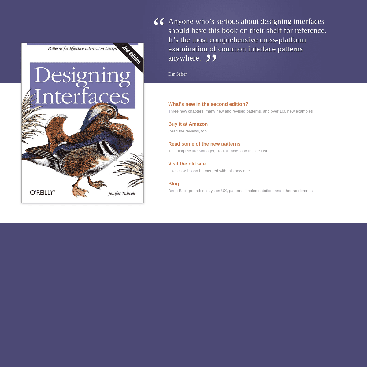
“
Anyone who’s serious about designing interfaces should have this book on their shelf for reference. It’s the most comprehensive cross-platform examination of common interface patterns anywhere.”
Dan Saffer
* What’s new in the second edition? Three new chapters, many new and revised patterns, and over 100 newexamples.
* Buy it at Amazon
Read the reviews, too. * Read some of the new patterns Including Picture Manager, Radial Table, and Infinite List. * Visit the old site ...which will soon be merged with this new one.* Blog
Deep Background: essays on UX, patterns, implementation, and otherrandomness.
Details
4